为什么要搭建博客
以前用Wordpress弄了一个学术主页,还比较满意。但是最近又在琢磨着弄一个博客,分开弄主要是想着把学术和生活分开。
但我其实并没有很强的表达欲,所以还没想好博客里主要放一些什么内容。第一篇文章是关于塔罗牌的,是我最近感兴趣的东西。所以这个博客应该主打一个“一时兴起”,最近在做什么就写什么。
做法
首先声明:我本人没有任何的写码能力,所有的代码都是网上查阅得来或是由ChatGPT生成。所以我不知道这些代码是否是可复现的。请谨慎参考。
我首先搜索的关键词是“GitHub 搭建博客”,参考的教程是这个(搜出来的第一个)。因为我npy的个人主页(不是Links里的那个博客)是用GitHub弄的,所以我只知道GitHub似乎可以搭博客的样子。用这个教程我弄出了一个简陋的页面,上书一行小字:“Hello World”。
然后我发现了Hexo这个东西。不记得是怎么知道的了,可能是出现在刚才的搜索结果里。点进去看好像不是很难的样子。然而真正动起手来bug还是层出不穷……
不过现在我相信使用它们是正确的做法。一个优点在于它使得我的文件都保存在本地,让人很有安全感。(我本人对非本地的存储等等都不是很放心,因此购买了一个512G、一个2T的移动硬盘用来备份我手机、iPad和电脑里的破烂。但是我设备里也没啥很珍贵的东西,其实没了就没了。某种敝帚自珍!)
我参考的教程主要有这个和这个。其实都大同小异,因为步骤实在也不多。但我在建站的过程中居然屡屡受挫。我用Hexo创建并部署了站点之后,等了很久,页面还是一开始的Hello World(而不是Hexo的那个默认界面)。经过一番猜测和思考,我折腾了一通又将配置文件恢复成原来模样,结果——好了。完全不知道怎么回事。也许是我其实做了一些正确的修改,也许就是玄学。
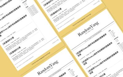
接下来开始选主题。我希望整个网站的风格比较极简,留白比较大,以及最好有夜间模式(不强求)。我最开始选择的主题叫“paper”,长下面这样:
结果,完全不能用……生成的页面都是无格式的样子,而且我最后也没有找到问题出在哪里。所以下一个,leedom:
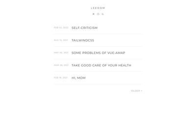
这个倒是可以用,不过它的字体对我来说有些花哨了。所以我继续寻找下一个。这次找到的是名为“july”的主题:
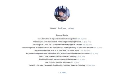
多么简洁!完全!戳中了我的审美点!我立刻将其配置好,并添加了Categories和Tags页面。然后两个页面分别出现了不同的问题!
先说Tags:页面上没有内容。因为我的index文档里写了“title: Tags”,所以页面上有标题格式的“Tags”字样,但除此之外就没有别的了。按道理,只要index文档里写了“type: tags”,它就会自动生成一个列举了所有标签的页面。但是并没有。我查了半天,试了无数方法,都无法解决。
最后我发现:这个主题好像不包含Tags和Categories的页面……只好又换一个主题。这最后一个主题名叫“Chic”:
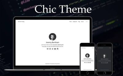
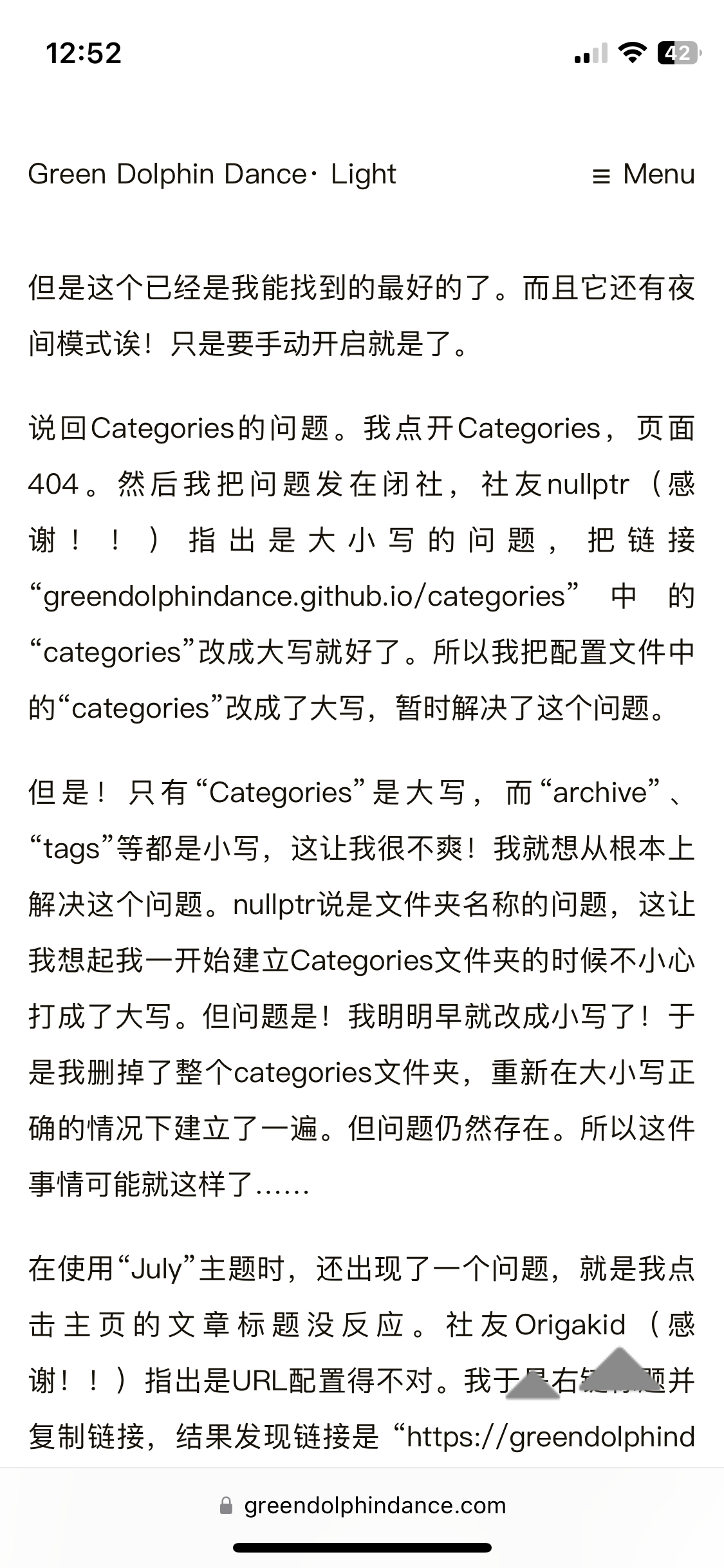
我把主页的那些图标删掉了,就显得简洁了一些。虽然我比较喜欢在主页显示Recent Post的那种主题,但是这个已经是我能找到的最好的了。而且它还有夜间模式诶!只是要手动开启就是了。
说回Categories的问题。我点开Categories,页面404。然后我把问题发在闭社,社友nullptr(感谢!!)指出是大小写的问题,把链接“greendolphindance.github.io/categories”中的“categories”改成大写就好了。所以我把配置文件中的“categories”改成了大写,暂时解决了这个问题。
但是!只有“Categories”是大写,而“archive”、“tags”等都是小写,这让我很不爽!我就想从根本上解决这个问题。nullptr说是文件夹名称的问题,这让我想起我一开始建立Categories文件夹的时候不小心打成了大写。但问题是!我明明早就改成小写了!于是我删掉了整个categories文件夹,重新在大小写正确的情况下建立了一遍。但问题仍然存在。所以这件事情可能就这样了……
在使用“July”主题时,还出现了一个问题,就是我点击主页的文章标题没反应。社友Origakid(感谢!!)指出是URL配置得不对。我于是右键标题并复制链接,结果发现链接是 “https://greendolphindance.github.io/greendolphindance.github.io/2023/10/06/塔罗牌为什么不会出错/”,“greendolphindance.github.io”神秘地出现了两次!我再试着输入“greendolphindance.github.io/2023/10/06/塔罗牌为什么不会出错”,发现可以正常打开。那么问题就很明显了。
但是为什么会出现这样的问题呢?经过一番艰难思索,我突然悟了,是我很早之前跟着某个教程在URL下面添加了一行:“root: greendolphindance.github.io”,为了解决前面出现的某个问题。然后可能问题用其他的方法解决了,但是这一行就忘记删掉了。所以通过某种机制,它让我的URL出现了问题。然后这个问题也解决了。
总而言之最后还是有惊无险地成功了!我之所以喜欢折腾就是因为喜欢寻找解决方案的过程以及找到解决方案带来的成就感,所以对这一过程我表示十分满意。一些小缺憾就是上述某些问题没有找到根本性的解决方法,或是解决了却不知其原理。但是我居然做出了一个可以运转的博客呢!想想就很激动。
其实还想试试添加评论和浏览量功能,但经过一番考察,我发现这些功能好像是挂靠(?)在主题下的,也就是说有的主题的文件包含和评论功能相关的代码,因此可以添加评论功能,但有的主题不行(也许可能可以自己写吧但是这对我来说太超过了……)。我这个主题大概不行,所以就干脆地放弃了。
Markdown
本站的所有文章都在本地以.md格式储存。所以要写文章,需要一个Markdown编辑器。
我一开始使用的是Xcode,因为双击文件就自动用它打开了……它很明显完全不适合,没有高亮也不能预览,不过也不能怪它,毕竟它被发明出来并不是用来写Markdown的。
然后我想着能不能利用电脑上现成的工具,于是把目光转向了Sublime Text。我平常用它写LaTeX,然后它好像插件很丰富的样子,就想会不会有插件支持Markdown高亮(我对预览的需求不是很高)。结果确实有,但我试了好几个都不太行,不知道是我的问题还是它们的问题。所以放弃了。
结果最后还是下载了Typora!我对它有好感的一点是它是买断制(点名批评某U姓APP),而且14.99刀也不算太离谱。其他的功能等等都蛮好的,不过我要求不高,只要高亮就可以(当然也可以Typora这种边写边预览的模式),也许一些免费的APP也可以满足,感觉还是有折腾的空间。但是再说吧!
访问数和评论系统
在Origakid的帮助下添加了访问数和评论系统!原来跟主题无关,只要找到合适的服务,然后在相应的文档里添加代码就可以。好玩!原话如下:
@Revolver Congratulations! 另外想添加评论功能的话可以参见giscus ,浏览量可以使用不蒜子 (记得对博客关闭AdBlock等屏蔽插件),这两个都是很简洁方便的实现方式,……
我于是在giscus的网站上生成了代码块,然后粘贴到/greendolphindance/themes/Chic/layout/_page/post.ejs里。为什么是这个post.ejs而不是别的post.ejs呢?因为我本来想每个都试一遍,结果第一个试的就是这个。然后网上有些教程说复制到article.ejs,但我压根没找到这个文档,我觉得post和article应该是一个意思吧?
需要注意的是Origakid在评论区指出的那一点,即要把代码块复制到文档末尾“</article>”之前。否则评论区和文章会不等宽。
不蒜子的话,因为官网只写了两行代码,没写咋用,所以我还参考了这个教程。配置并不难。同样地,最好把标签代码放在版权信息之后、“</div>”之前,否则访问数会在版权信息的基础上另起一行,不够美观。
我本来写的是“感谢xx位访客”,然后发现太长了手机端显示成了两行。所以干脆删掉文字直接显示了“xx”。
回到顶部
试着添加了“回到顶部”按钮!参考的教程是这个。
首先跟着教程添加了相应的文件和代码,然后hexo s,果然不行(。我已经逐渐习惯我的这种折腾难以成功的体质了……
然后求助了我亲爱的男朋友,他说可能是因为这个用了jQuery,然后需要把jQuery的js文件也添加进去。
我:什么事jQuery?什么文件?添加到哪里?
(省略一些解释环节……)
最后终于弄懂了,要去网上下载一个叫jQuery.js的文件,添加到博客目录下放js文件的地方(我的是/greendolphindance/themes/Chic/source/js)。放进去之后,还要进行一些配置,也就是在某个文件添加某一行代码。
那么是哪个文件呢?我亲爱的男朋友推测是_config.yml。我机智地理解成主题文件夹内的_config.yml,而不是根目录下的那一个,事实证明是正确的。在该文档内搜索“js”,发现这么一段代码:
# scripts loaded in the end of the body
scripts:
	- /js/script.js
	- /js/tocbot.min.js
|
我努力理解了一下,这是在body的end加载这两个js文件的意思!然后一个天才的想法就出现在我的脑海里:我把jQuery.js加进去不就得了吗!
但我又经过了一番缜密的思考:这个教程又叫我创建了一个名叫totop.js的文件,难道只加载jQuery.js,不加载这个吗?最后的结论是:两个都加上!
然后就好了!!(其实最后分别把两个文件名注释掉进行试验,发现起作用的只有jQuery.js。)
就这样,这个问题也被我在不明所以的情况下解决了!特别鸣谢我亲爱的男朋友!
进阶
突然(2023-10-18)觉得手机上的“回到顶部”图标太大了,于是想到修改代码。我分别下载了长宽为48px和32px的图标,分别命名为back-top-48.png和back-top-32.png,保存到/themes/light/source/imgs目录下。
将totop.ejs的代码修改如下:
<div id="totop" style="position:fixed;bottom:20px;right:30px;cursor: pointer;">
    <a title="返回顶部">
        <img src="/imgs/back-top-32.png" class="back-top-small"/>
        <img src="/imgs/back-top-48.png" class="back-top-large"/>
    </a>
</div>
|
在任意CSS文档里添加如下代码:
.back-top-large {
    display: none;
}

@media (min-width: 1281px) {
    .back-top-small {
        display: none;
    }
    .back-top-large {
        display: block;
    }
}
|
JS代码无需修改。
部署后发现,手机端出现了一大一小两个图标!电脑端正常。
排查发现,手机开启无痕浏览模式时显示正常。大概是缓存问题。于是清理缓存,问题解决。
再进阶
这个“回到顶部”的设置是,在页面没有滚动到指定高度时,按钮不显示;只有在页面滚动了一阵之后,按钮才出现。这本身没问题。问题在于在页面没有滚动到指定高度时,按钮并不是隐藏了,而只是变得透明了,仍然可以点击。有时候会误触,很难受,遂修改totop.js的代码:
(function($) {
var upperLimit = 1000;
var scrollElem = $('#totop');
var scrollSpeed = 500;
scrollElem.hide();
$(window).scroll(function () {
var scrollTop = $(document).scrollTop();
if (scrollTop > upperLimit) {
$(scrollElem).stop().fadeIn(300);
} else {
$(scrollElem).stop().fadeOut(300);
}
});
$(scrollElem).click(function(){
$('html, body').animate({scrollTop:0}, scrollSpeed); return false;
});
})(jQuery);
|
问题解决。
再再进阶
由于PNG格式的图片显示起来不太清楚,社友茨月建议我使用svg格式。于是修改totop.ejs代码如下:
<div id="totop" style="position:fixed;bottom:20px;right:30px;cursor: pointer;">
<a title="返回顶部">
<svg t="1697771647324" class="icon back-top-svg" viewBox="0 0 1024 1024" version="1.1" xmlns="http://www.w3.org/2000/svg" p-id="2324" width="32px" height="32px">
<path d="M946.494 754.216c19.445-19.445 19.445-51.265 0-70.711L547.355 284.368c-19.445-19.445-51.265-19.445-70.711 0L77.506 683.506c-19.445 19.445-19.445 51.265 0 70.711" p-id="2325" fill="#8a8a8a"></path>
</svg>
</a>
</div>
<style>
.back-top-svg {
width: 32px;
height: 32px;
}
@media (min-width: 768px) {
.back-top-svg {
width: 48px;
height: 48px;
}
}
</style>
|
并删除CSS文档里的代码。
订阅
添加了订阅功能。主要参考的教程是这个(生成RSS订阅文件)和这个(自动发送邮件),实现后者使用的是TinyLetter和Zapier。过程中居然没出什么岔子,唯一的问题是我在测试订阅链接的时候,输入了清华邮箱想要订阅,结果一直收不到确认邮件。过了半个小时之后终于收到了,不过这时候我已经全部弄好了。
那么,欢迎订阅!
2023-10-10更新:靠,订阅挂掉了,TinyLetter不知道为什么把我的账号ban掉了。我又从社友处了解到RSS订阅也可以采取邮件推送的形式,比如使用Briefcake。所以就这样吧,请使用RSS订阅。
留言板
添加了留言板功能。起初搜了一些教程,但都是教你怎么建立Guestbook页面的,没有说怎么把留言板放到新页面里面去。所以自己动手吧!
首先建立新页面,在博客根目录下执行:
hexo new page guestbook
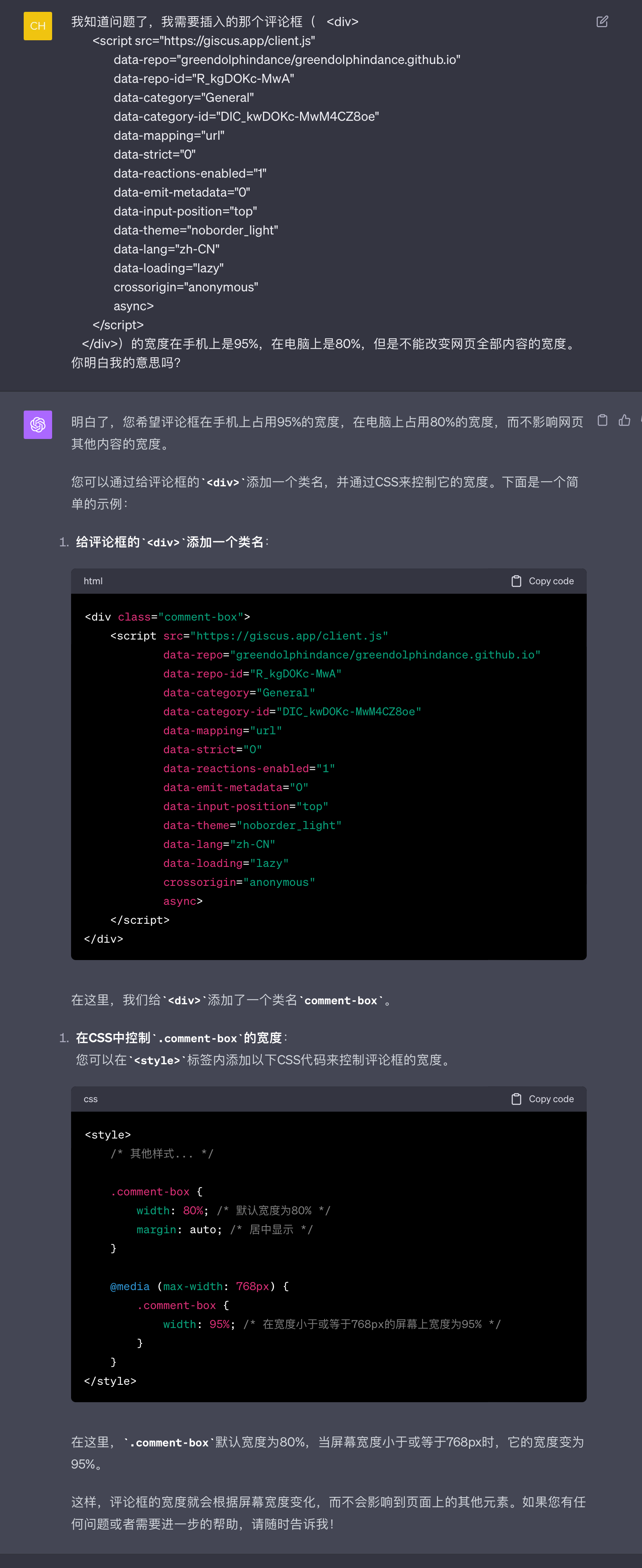
然后进去把layout改成guestbook。所以我们现在需要一个叫guestbook的layout。在/greendolphindance/themes/Chic/layout里建一个叫guestbook.ejs的文档,然后把giscus上生成的代码块粘贴进去。完成了!
不过怎么有点丑?这个评论框和网页是等宽的。所以接下来要调整它的宽度并且把它居中。html语法我是一点不会,于是求助了我亲爱的男朋友,他告诉了我宽度怎么调,但让我自己查居中怎么调(让我考考你.jpg)。然后我就查到了,其实很简单,用
<div style="width:80%; margin:auto;">
和
</div>
把代码包起来就行了。
进阶
之前留言板的宽度设置为80%,电脑和手机端一样。这样的话,手机端似乎就有些太窄了。我想实现“电脑端宽度为80%,手机端宽度为100%”,怎么办呢?
突然想起之前开了GPT-4。问问ChatGPT吧!
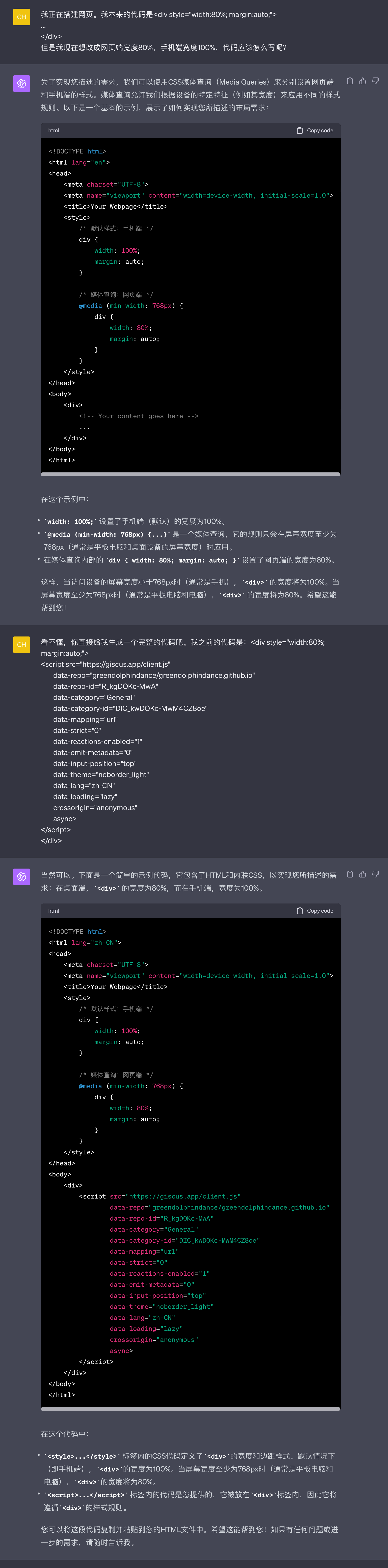
用GPT给的代码替换掉layout文件夹里原来文档中的代码,立刻解决了(后来觉得不好看,又把手机端的宽度改成了95%)。难道我真的是天才?
然后发现给的代码是错的……它直接把整个网页的宽度变成了80%和95%,导致菜单之类的东西都挤到一起了。所以又追问了一下:
这样就好了。学到了!
再进阶
今天(2023-10-17)想到留言板应该和文章等宽。用网页检查器查到电脑端和iPad端宽度都是780px,手机端是370.67px,于是修改部分的代码如下:
<head>
<meta charset="UTF-8">
<meta name="viewport" content="width=device-width, initial-scale=1.0">
<title>Your Webpage</title>
<style>
.comment-box {
width: 100%;
max-width: 780px;
margin: auto;
}
@media (max-width: 1024px), (orientation: portrait) {
.comment-box {
width: 100%;
max-width: 780px;
margin: auto;
}
}
@media (max-width: 767px) {
.comment-box {
width: 100%;
max-width: 370.67px;
margin:auto;
}
}
body {
background-color: white;
color: black;
}
</style>
</head>
|
然后还是不对,因为手机竖屏时文章的宽度会根据手机型号的不同而不同。所以似乎需要找到一个相对宽度。我查找了iPhone SE、iPhone XR和iPhone 12 Pro上的文章宽度,并让ChatGPT根据手机尺寸进行计算:
- iPhone SE: 345.67 / 375 ≈ 0.922
- iPhone XR: 384.67 / 414 ≈ 0.929
- iPhone 12 Pro: 360.67 / 390 ≈ 0.925
于是取了大致的中间值0.925。然后代码有点乱,又整理了一下,最后的成品是:
<head>
<meta charset="UTF-8">
<meta name="viewport" content="width=device-width, initial-scale=1.0">
<title>Green Doplhin Dance</title>
<style>
.comment-box {
width: 100%;
max-width: 780px;
margin: auto;
}
@media (max-width: 767px) {
.comment-box {
width: 92.5%;
margin: auto;
}
}
</style>
</head>
|
其实最好还是找到不同手机型号文章宽度的规律,但是我不知道怎么找。只好用一个近似值了。但我这个代码也挺简洁的,而且显示效果八九不离十。
域名
一开始决定建博客的时候,没想到付出了如此巨大的努力。为了让自己的努力得到回报,奖励自己一个域名吧!
在Godaddy上买了一个域名,用找券插件找了一个优惠券,竟然只花了$1.17(一年)。开始配置吧——
果不其然,配置失败!页面404。
首先参考的是这个教程。配置好后,GitHub上的Pages页显示DNS check successful,但是网站打不开。然后我查到了这个,上面说要添加的IP地址不是一个,而是四个。IP地址可以在GitHub的这个官方页面找到。那就加吧!加了四个name为“@”的,还是404。
这个时候Godaddy的DNS页面上有四个name为@的项目和一个name为www的项目。此时我已经精神错乱,想着这个www好难受啊,删了算了,于是把它删掉了。
然后GitHub的Pages页面上的DNS check突然就不行了!
这让我灵机一动,会不会应该添加的name不是@,而是www呢?于是一鼓作气用www作为name添加了四个IP地址。
还是不行。我垂头丧气,决定先放它一放。
过了大概十五分钟,我随便刷新了一下,突然就好了!
然后我在GitHub的那个官方页面上看到这么一句话:
Note: DNS changes can take up to 24 hours to propagate.
所以其实只是等一下就好了吗!我折腾了这么久,结果不知道起作用的究竟是我的折腾还是我的等待。因为太麻烦了,我也不想去测试,所以就这样吧。暂时没有很强的求知精神。
刚发现换了新域名之后评论全都消失了!冷静下来瞬间发现了问题出在哪里。把GitHub的Discussion相应标题里的“greendolphindance.github.io“改成”greendolphindance.com“就好了。
博文整理
今天(2023-10-10)一早起来,突发奇想想把本地的所有博文放在一个以年份命名的文件夹里。但是这好像会改变文章的URL,再次导致评论消失,怎么办呢?
答案在这里。只需要看文章的开头就可以了,开头是此文评论区提到的简便方法,其余的都是作者在瞎折腾。方法很简单,只需要在根目录下的_config.yml中搜索“new_post_name“,在相应位置改成new_post_name: :year/:title.md就可以了,其他地方不用改,也就是保持permalink那一行为permalink: :name/ 。
这样,就可以在不改变文章URL的前提下,把本地的博文按年份分类啦。
音乐
在About页面添加了一个歌单。参考了这个教程,尤其是“为博客添加音乐页面”小标题下的内容。方法很简单,安装hexo-tag-aplayer插件并根据教程配置好,然后把以下这段代码
<link rel="stylesheet" href="https://cdn.jsdelivr.net/npm/aplayer@1.10/dist/APlayer.min.css">
<script src="https://cdn.jsdelivr.net/npm/aplayer@1.10/dist/APlayer.min.js"></script>
<script src="https://cdn.jsdelivr.net/npm/meting@1.2/dist/Meting.min.js"></script>
{% meting "7868005687" "tencent" "playlist" "theme:#555" "mutex:true" "listmaxheight:1000px" "preload:auto" %}
|
中的“7868005687”和“tencent”分别改成我自己歌单的ID和“netease”,然后放入/greendolphindance/source/about/index.md内即可。
夜间模式
评论框的夜间模式
本来一切都好好的,直到我在guestbook页面点开了夜间模式。漆黑的背景和惨白的评论框形成的鲜明对比,让我再也坐不住了。
我的需求:我想使用giscus的noborder主题,同时又想让它跟随网页的色彩模式。没有现成的东西可抄,我得自己写。谁要自己写!问问ChatGPT吧!
反复询问ChatGPT,失败无数次,终于被我问出了正确的代码:
<link rel="stylesheet" href="https://cdn.jsdelivr.net/npm/aplayer@1.10/dist/APlayer.min.css">
<script src="https://cdn.jsdelivr.net/npm/aplayer@1.10/dist/APlayer.min.js"></script>
<script src="https://cdn.jsdelivr.net/npm/meting@1.2/dist/Meting.min.js"></script>
{% meting "7868005687" "tencent" "playlist" "theme:#555" "mutex:true" "listmaxheight:1000px" "preload:auto" %}
<script>
document.addEventListener('DOMContentLoaded', function() {
function changeGiscusTheme() {
const theme = document.body.classlist.contains('dark-theme') ? 'dark' : 'light';
function sendMessage (message) {
const iframe = document.querySelector('iframe.giscus-frame');
if (liframe) return;
iframe.contentWindow postMessage(f giscus: message }, 'https://giscus.app');
}
sendMessage ( {
setConfig: {
}
theme: theme === 'dark' ? 'noborder_dark' : 'noborder_light'
}):
}
changeGiscusTheme ();
const observer = new MutationObserver(function(mutations) {
mutations. forEach(function(mutation) {
if (mutation.attributeName === 'class') {
changeGiscusTheme () ;
}
});
3);
observer observe (document. body, { attributes: true });
});
</script>
|
将这段代码插入post.ejs和guestbook.ejs中的</body>前面即可。
其中后半截代码是没有用的……是我在调试成功之后发现,如果本身打开了网页的夜间模式,再进入guestbook时,giscus是不会转换成夜间模式的。要关掉网页的夜间模式再打开,giscus才会是夜间模式。问了ChatGPT,给了我后半截代码,但是输进去还是这样。暂时放弃了,哪天闲的时候再调试吧。
2023-10-12更新:明明很忙,还是手痒来调试了。花了大量时间成功了。解决方法可以看这个页面。
啊啊啊还是没解决,电脑端好了,但是手机端还有相同的问题……我又把这个issue reopen了。
2023-10-13更新:勉强解决了。我已经无力复盘了,所以以下是ChatGPT的总结:
问题概述
当使用夜间模式切换器在桌面端切换网站的颜色模式时,嵌入的 Giscus 评论区的颜色模式也会相应地切换。然而,在移动端,尽管网站的颜色模式已切换,评论区的颜色模式却保持不变。
尝试(未成功)的解决方法
使用 JavaScript 监听颜色模式切换并刷新评论区
尝试使用 JavaScript 代码来监听颜色模式的切换,并在切换发生时刷新 Giscus 评论区。这在桌面端有效,但在移动端无效。
使用双 iframe 切换
考虑了一种方法,即在页面上放置两个 Giscus 评论区的 iframe(一个用于夜间模式,一个用于日间模式),并在颜色模式切换时在它们之间切换。这个方法被认为过于复杂且可能影响页面性能,因此没有进一步尝试。
尝试修改 Giscus 的源代码
考虑直接修改 Giscus 的源代码来解决问题。然而,由于 Giscus 是一个第三方服务,我们无法直接修改其源代码。
成功的解决方法
确定正确的移动端切换按钮选择器
通过检查 HTML 代码,我们发现移动端的颜色模式切换按钮使用了一个 id(mobile-toggle-theme)而非 class。因此,我们需要使用正确的选择器来选中这个元素。
使用 JavaScript 刷新页面
当颜色模式切换时,我们使用 JavaScript 来刷新整个页面,而不仅仅是评论区。这样,评论区会在新的颜色模式下重新加载。
最终的代码实现
在你的 HTML 或 JavaScript 文件中,添加以下代码:
document.addEventListener('DOMContentLoaded', function () {
const toggleDesktop = document.querySelector('label[for="switch_default"]');
const toggleMobile = document.querySelector('#mobile-toggle-theme');
function handleToggle() {
location.reload();
}
if (toggleDesktop) {
toggleDesktop.addEventListener('click', handleToggle);
}
if (toggleMobile) {
toggleMobile.addEventListener('click', handleToggle);
}
});
|
这段代码首先尝试选中桌面端和移动端的颜色模式切换按钮。一旦按钮被点击,handleToggle 函数会被调用,刷新整个页面。这样,无论在桌面端还是移动端,评论区都会在新的颜色模式下重新加载。
希望这个总结能够清晰地反映整个问题解决的过程!如果你有任何进一步的问题或疑虑,随时告诉我!
这个方案是我想出来的,异常丑陋,因为它导致切换主题的时候整个页面都会被刷新……不过我也没有更好的办法。所以先这样吧。想把这个方案放到GitHub Issue上去,但不close,看看有没有人有更好的方式。
它给我的代码和它自己总结的有点不一样,是长下面这样:
<script>
document.addEventListener('DOMContentLoaded', function () {
function getGiscusTheme() {
const theme = document.body.classList.contains('dark-theme') ? 'dark' : 'light';
return theme === 'dark' ? 'noborder_dark' : 'noborder_light';
}
function setGiscusTheme() {
function sendMessage(message) {
const iframe = document.querySelector('iframe.giscus-frame');
if (!iframe) return;
iframe.contentWindow.postMessage({ giscus: message }, 'https://giscus.app');
}
sendMessage({
setConfig: {
theme: getGiscusTheme(),
},
});
}
function handleToggle() {
location.reload();
}
const toggleDesktop = document.querySelector('label[for="switch_default"]');
const toggleMobile = document.querySelector('#mobile-toggle-theme');
if (toggleDesktop) {
toggleDesktop.addEventListener('click', function() {
setGiscusTheme();
});
}
if (toggleMobile) {
toggleMobile.addEventListener('click', function() {
handleToggle();
});
}
setTimeout(() => {
const giscusAttributes = {
"src": "https://giscus.app/client.js",
"data-repo": "greendolphindance/greendolphindance.github.io",
"data-repo-id": "R_kgDOKc-MwA",
"data-category": "General",
"data-category-id": "DIC_kwDOKc-MwM4CZ8oe",
"data-mapping": "url",
"data-strict": "0",
"data-reactions-enabled": "1",
"data-emit-metadata": "0",
"data-input-position": "top",
"data-theme": getGiscusTheme(),
"data-lang": "zh-CN",
"crossorigin": "anonymous",
};
const giscusScript = document.createElement("script");
Object.entries(giscusAttributes).forEach(([key, value]) => giscusScript.setAttribute(key, value));
document.querySelector('article').appendChild(giscusScript);
}, 1000);
});
</script>
|
然后我突然灵光一现,试着把中间的两个“if”里面的内容改成:
if (toggleDesktop) {
     toggleDesktop.addEventListener('click', function() {
         setGiscusTheme();
     });
 }

 if (toggleMobile) {
     toggleMobile.addEventListener('click', function() {
         setGiscusTheme();
     });
 }
|
再deploy。然后就好了!不用刷新,评论框也会随着主题变化而改变颜色!可是我根本不知道为什么它就work了!
歌单的夜间模式
(这部分内容向社友neruko请教了很多,特别感谢!)
APlayer这个插件本来是没有夜间模式的,所以要自己弄一个。播放器块状部分和线状部分(边框等)的颜色需要分别指定。在About页面的index.md将歌单的代码改为如下:
<link rel="stylesheet" href="https://cdn.jsdelivr.net/npm/aplayer@1.10/dist/APlayer.min.css">
<style>
body {
transition: background-color 0.3s, color 0.3s;
}
body {
background-color: #ffffff;
color: #000000;
}
body.dark-theme {
background-color: #292a2d;
color: #ffffff;
}
body .aplayer-body,
body .aplayer-info,
body .aplayer-notice,
body .aplayer-list {
background-color: #ffffff;
}
body.dark-theme .aplayer-body,
body.dark-theme .aplayer-info,
body.dark-theme .aplayer-notice,
body.dark-theme .aplayer-list {
background-color: #292a2d;
}
body.dark-theme .aplayer .aplayer-list .aplayer-list-light {
background-color: #505254 !important;
}
body.dark-theme .aplayer .aplayer-list ol li:hover {
background: #414345;
}
body.dark-theme .aplayer .aplayer-list ol li {
border-top: 1px solid #414345;
}
body.dark-theme .aplayer-lrc::before,
body.dark-theme .aplayer-lrc::after {
background: linear-gradient(to bottom, #292a2d, #292a2d);
}
body.dark-theme .aplayer-list-cur {
background-color: #aaaaaa !important;
}
body.dark-theme .aplayer .aplayer-icon-volume-down:hover path,
body.dark-theme .aplayer .aplayer-icon-order:hover path,
body.dark-theme .aplayer .aplayer-icon-loop:hover path,
body.dark-theme .aplayer .aplayer-icon-menu:hover path {
fill: #eeeeee !important;
}
body.dark-theme .aplayer-info {
border-bottom: none !important;
}
body.dark-theme .aplayer {
box-shadow: 0 2px 4px 0 rgba(170, 170, 170, 0.2), 0 3px 10px 0 rgba(170, 170, 170, 0.19) !important;
}
</style>
<script src="https://cdn.jsdelivr.net/npm/aplayer@1.10/dist/APlayer.min.js"></script>
<script src="https://cdn.jsdelivr.net/npm/meting@1.2/dist/Meting.min.js"></script>
{% meting "8793002560" "netease" "playlist" "theme:#555" "mutex:true" "listmaxheight:2000px" "preload:auto" %}
|
有很多乱七八糟的代码……都是我发现样式不对然后临时加上一些。然后似乎是在script.js的最后插入如下代码,但是由于我看不太懂,我也不清楚是不是确实是如下代码:
document.ready(
() => {
var _Blog = window._Blog || {};
const currentTheme = window.localStorage && window.localStorage.getItem('theme');
const isDark = currentTheme === 'dark';
const pagebody = document.getElementsByTagName('body')[0]
if (isDark) {
document.getElementById("switch_default").checked = true;
document.getElementById("mobile-toggle-theme").innerText = "· Dark"
} else {
document.getElementById("switch_default").checked = false;
document.getElementById("mobile-toggle-theme").innerText = "· Light"
}
_Blog.toggleTheme = function () {
if (isDark) {
pagebody.classList.add('dark-theme');
document.getElementById("mobile-toggle-theme").innerText = "· Dark"
} else {
pagebody.classList.remove('dark-theme');
document.getElementById("mobile-toggle-theme").innerText = "· Light"
}
document.getElementsByClassName('toggleBtn')[0].addEventListener('click', () => {
if (pagebody.classList.contains('dark-theme')) {
pagebody.classList.remove('dark-theme');
} else {
pagebody.classList.add('dark-theme');
}
window.localStorage &&
window.localStorage.setItem('theme', document.body.classList.contains('dark-theme') ? 'dark' : 'light',)
})
document.getElementById('mobile-toggle-theme').addEventListener('click', () => {
if (pagebody.classList.contains('dark-theme')) {
pagebody.classList.remove('dark-theme');
document.getElementById("mobile-toggle-theme").innerText = "· Light"
} else {
pagebody.classList.add('dark-theme');
document.getElementById("mobile-toggle-theme").innerText = "· Dark"
}
window.localStorage &&
window.localStorage.setItem('theme', document.body.classList.contains('dark-theme') ? 'dark' : 'light',)
})
};
_Blog.toggleTheme();
}
);
|
应该就可以了……吧。我也不是很确定。请原谅我这个简陋的总结……
About页面夜间模式时的字体颜色
突然发现About页面在夜间模式的字体是惨白色,不仅不好看,而且和其中的链接的颜色相同,不像日间模式的时候是文字黑色、链接蓝色。参考Posts中的颜色,发现在夜间模式时,标题和正文的字体颜色是#a9a9b2,链接颜色是白色。于是想统一一下颜色。
根据ChatGPT的指导,在custom.styl中插入如下代码:
body.dark-theme .post-title {
    color: #a9a9b2;
}

body.dark-theme .post-content {
    color: #a9a9b2;
}
|
即可。
夜间模式随系统颜色模式开启
在/js/script.js中添加如下代码:
window.onload = function() {
const themeToggleCheckbox = document.getElementById('switch_default');
const themeToggleButton = document.getElementById('mobile-toggle-theme');
const userPrefersDark = window.matchMedia && window.matchMedia('(prefers-color-scheme: dark)').matches;
if (userPrefersDark) {
document.body.classList.add('dark-theme');
themeToggleCheckbox.checked = true;
themeToggleButton.textContent = '· Dark';
} else {
document.body.classList.remove('dark-theme');
themeToggleCheckbox.checked = false;
themeToggleButton.textContent = '· Light';
}
themeToggleCheckbox.addEventListener('change', function() {
document.body.classList.toggle('dark-theme', themeToggleCheckbox.checked);
});
};
|
其中包括电脑端和移动端。一开始踩了个坑是在同一个页面中用了两个“window.onload”函数,结果前一个被后一个覆盖了。然后把两个合并成一个,就修好了。注释很详细,其中一部分代码是用于在网页随系统自动切换成夜间模式的时候,让Toggle呈打开状态(或是在移动端时,显示“Dark”)。一点小小强迫症。
夜间模式下切换页面时发生白色闪烁
这个问题虽然解决了,但是从日间自动切换到夜间模式的速度很慢,表现为屏幕会闪烁一下白色。问了ChatGPT,按道理来说这个不应该用JavaScript改,应该直接在CSS里面改,不过我懒得再重新研究了,于是问GPT能不能在我JavaScript代码的基础上进行优化。它给了这么一段代码:
document.addEventListener('DOMContentLoaded', function() {
const themeToggleCheckbox = document.getElementById('switch_default');
const themeToggleButton = document.getElementById('mobile-toggle-theme');
const userPrefersDark = window.matchMedia && window.matchMedia('(prefers-color-scheme: dark)').matches;
if (userPrefersDark) {
document.body.classList.add('dark-theme');
themeToggleCheckbox.checked = true;
themeToggleButton.textContent = '· Dark';
} else {
document.body.classList.remove('dark-theme');
themeToggleCheckbox.checked = false;
themeToggleButton.textContent = '· Light';
}
themeToggleCheckbox.addEventListener('change', function() {
document.body.classList.toggle('dark-theme', themeToggleCheckbox.checked);
themeToggleButton.textContent = themeToggleCheckbox.checked ? '· Dark' : '· Light';
});
});
|
改过之后还是有白色闪烁,不过加载速度是快一点了。
新的问题
结果又有了别的问题……在系统为夜间模式的情况下,将按钮调到日间模式,页面变白。但是当点击链接跳转到其他页面时,页面又会转为黑色。所以又让GPT生成了新的代码:
document.addEventListener('DOMContentLoaded', function() {
const themeToggleCheckbox = document.getElementById('switch_default');
const themeToggleButton = document.getElementById('mobile-toggle-theme');
const userPrefersDark = window.matchMedia && window.matchMedia('(prefers-color-scheme: dark)').matches;
if (userPrefersDark) {
document.body.classList.add('dark-theme');
themeToggleCheckbox.checked = true;
themeToggleButton.textContent = '· Dark';
} else {
document.body.classList.remove('dark-theme');
themeToggleCheckbox.checked = false;
themeToggleButton.textContent = '· Light';
}
themeToggleCheckbox.addEventListener('change', function() {
document.body.classList.toggle('dark-theme', themeToggleCheckbox.checked);
themeToggleButton.textContent = themeToggleCheckbox.checked ? '· Dark' : '· Light';
});
});
|
似乎暂时解决了问题。
白色闪烁2
(2023-10-19)又折腾了,想让GPT把相同的逻辑在ejs文件里操作完成,而不是js文件里,从而看看能不能减少闪烁。GPT给出的建议是:
将 JavaScript 逻辑放在 HTML 文档的 <head> 部分,并直接在其中执行(而不是等待 DOMContentLoaded 事件),可能会帮助减少页面加载时的闪烁。以下是如何在 HTML 文档的 <head> 部分内嵌此逻辑的示例:
<!DOCTYPE html>
<html lang="<%= config.language %>">
<head>
<%- partial('_partial/head',{cache: true}) %>
<script>
(function() {
const savedTheme = sessionStorage.getItem('theme');
const userPrefersDark = window.matchMedia && window.matchMedia('(prefers-color-scheme: dark)').matches;
const useDarkMode = savedTheme ? savedTheme === 'dark' : userPrefersDark;
if (useDarkMode) {
document.documentElement.style.backgroundColor = '#121212';
document.documentElement.classList.add('dark-theme');
}
})();
</script>
</head>
<body>
<script>
document.addEventListener('DOMContentLoaded', function() {
const themeToggleCheckbox = document.getElementById('switch_default');
const themeToggleButton = document.getElementById('mobile-toggle-theme');
themeToggleCheckbox.addEventListener('change', function() {
const isDark = themeToggleCheckbox.checked;
document.body.classList.toggle('dark-theme', isDark);
themeToggleButton.textContent = isDark ? '· Dark' : '· Light';
sessionStorage.setItem('theme', isDark ? 'dark' : 'light');
});
});
</script>
</body>
</html>
|
在这里,我做了几个改动:
- 我在
<head> 中直接执行了一个自执行的函数,该函数会尽快地(在 DOM 完全加载之前)设置页面的主题。
- 我还设置了
document.documentElement.style.backgroundColor ,这可以更快地显示正确的背景颜色,减少从默认背景色到暗主题背景色的转变所导致的闪烁。
你可以根据自己网站的暗主题背景颜色修改临时背景色。希望这可以帮助减少闪烁问题!
改完之后体感闪烁变成了有时候有,有时候没有。于是又采纳了社友nekobus的建议:
把css里面的transition去掉
于是把base.styl里有关transition的代码都删除了。删除之后,闪烁时屏幕为白色的时间缩短了,也就是闪得更快了。
虽然还是没有完全解决问题,但是折腾了这么久,有这个结果我也很是欣慰了……以后看看还有没有优化的空间吧。
从头再来
2023-10-20更新:草,昨天博客崩了……修好之后上面的代码出问题了,只好又弄了一个,暂时还算是正确的?
<script>
(function() {
const savedTheme = sessionStorage.getItem('theme') || localStorage.getItem('theme');
const userPrefersDark = window.matchMedia && window.matchMedia('(prefers-color-scheme: dark)').matches;
const useDarkMode = savedTheme ? savedTheme === 'dark' : userPrefersDark;
if (useDarkMode) {
document.documentElement.classList.add('dark-theme');
}
})();
document.addEventListener('DOMContentLoaded', function() {
const themeToggleMobile = document.getElementById('mobile-toggle-theme');
function updateButtonText(isDark) {
themeToggleMobile.textContent = isDark ? '· Dark' : '· Light';
}
function toggleTheme() {
const isDark = document.documentElement.classList.toggle('dark-theme');
document.body.classList.toggle('dark-theme', isDark);
sessionStorage.setItem('theme', isDark ? 'dark' : 'light');
updateButtonText(isDark);
}
const initialIsDark = document.documentElement.classList.contains('dark-theme');
updateButtonText(initialIsDark);
themeToggleMobile.addEventListener('click', toggleTheme);
});
</script>
|
html元素始终是dark-theme类
晚上更新:随着夜幕的降临,我的系统切换成了夜间模式,结果……又出现了问题……
啊啊啊啊啊啊啊!!崩溃!
冷静下来开始解决问题。通过网页检查器调试,发现问题可以被表述为:html元素的类属性始终是“dark-theme“。于是开始调教GPT。
现在写prompt愈发熟练,然后又能够看得懂一点代码了,也会了一点调试方法,所以过程虽然曲折(GPT太蠢),但稳步前进。以下是GPT的总结:
解决问题总结:HTML 仍是夜间模式
问题描述
在尝试根据用户的系统偏好和用户切换来动态更改页面主题时,我们遇到了一个问题:即使在用户切换主题后,html 元素的类属性仍然被设置为 dark-theme。
尝试和失败的方法
尝试1:代码位置调整
首先尝试将 JavaScript 代码从 body 标签移到 head 标签,期望在页面加载前更早地应用主题。
结果: html 元素仍然保留了 dark-theme 类。
尝试2:调整 JavaScript 逻辑
尝试通过优化 JavaScript 逻辑来更精确地控制主题的应用,包括在页面加载时就根据存储的用户偏好设置主题。
结果: 调整后,依然没能解决 html 元素始终保持 dark-theme 类的问题。
尝试3:使用调试语句
通过在代码中添加调试语句来尝试找到问题所在,了解代码的实际执行流程和 html 元素类属性被修改的时机。
结果: 通过调试,我们了解到了代码的执行情况,但仍然没有解决问题。
成功的方法
方法:专注于 body 标签并且改进 JavaScript 逻辑
最终,我们决定集中注意力修改 body 元素的类属性,而不是 html 元素。同时,我们优化了 JavaScript 代码,使其在页面加载时更准确地根据用户的系统偏好和存储的主题偏好来设置主题。
在实际代码中,我们:
- 在 DOM 加载完成后执行 JavaScript 代码。
- 首先根据存储的主题偏好设置主题,如果没有存储的偏好,则根据用户的系统偏好设置主题。
- 最终成功的代码可以实时响应用户的切换操作,并在用户重新访问页面时记住用户的主题偏好。
这样,我们成功解决了 html 元素始终保持 dark-theme 类的问题,并确保了网站可以根据用户的偏好和操作实时地、准确地应用日间/夜间模式。
最终写出来的代码是这样的:
<script>
document.addEventListener('DOMContentLoaded', function() {
const savedTheme = localStorage.getItem('theme');
alert("Saved theme: ", savedTheme);
const userPrefersDark = window.matchMedia && window.matchMedia('(prefers-color-scheme: dark)').matches;
alert("User prefers dark theme: ", userPrefersDark);
let useDarkMode;
if (savedTheme === 'dark' || savedTheme === 'light') {
useDarkMode = savedTheme === 'dark';
} else {
useDarkMode = userPrefersDark;
}
alert("Using dark theme: ", useDarkMode);
document.body.classList.toggle('dark-theme', useDarkMode);
const themeToggleCheckbox = document.getElementById('switch_default');
if (themeToggleCheckbox) {
themeToggleCheckbox.checked = useDarkMode;
}
themeToggleCheckbox.addEventListener('change', function() {
const isChecked = themeToggleCheckbox.checked;
alert("Checkbox is checked: ", isChecked);
document.body.classList.toggle('dark-theme', isChecked);
localStorage.setItem('theme', isChecked ? 'dark' : 'light');
});
});
</script>
|
祈祷不要再出问题了……
白色闪烁3
惊讶地发现移动端已经很少出现白色闪烁了(虽然有时候还是有),但是桌面端的闪烁则仍很频繁。GPT给出了两个方案,我同时采纳了,体感闪烁频率有所减少,而且闪烁速度加快,但还是时不时会有。GPT的总结如下:
1. 优先执行主题设置的 JavaScript:
将处理主题的 JavaScript 代码放在页面 <head> 部分并优先执行。这是为了确保在加载和应用其他 CSS 或 JavaScript 之前,根据本地存储或用户的偏好来设置相应的主题。
<head>
    <script>
        (function() {
            const savedTheme = localStorage.getItem('theme');
            const userPrefersDark = window.matchMedia && window.matchMedia('(prefers-color-scheme: dark)').matches;
            let useDarkMode = savedTheme ? savedTheme === 'dark' : userPrefersDark;
            document.body.classList.toggle('dark-theme', useDarkMode);
        })();
    </script>
</head>
|
2. 使用 CSS 隐藏内容:
如果即便优先执行了主题设置代码仍然出现闪烁,可以考虑暂时使用 CSS 来隐藏页面的内容,直至 JavaScript 代码运行并应用了正确的主题。
body {
visibility: hidden;
}
body.theme-loaded {
visibility: visible;
}
|
在 JavaScript 中,当主题被正确设置后,您可以添加一个类(例如 theme-loaded)来显示页面内容。
document.addEventListener('DOMContentLoaded', function() {
const themeToggleCheckbox = document.getElementById('switch_default');
themeToggleCheckbox.addEventListener('change', function() {
const isChecked = themeToggleCheckbox.checked;
document.body.classList.toggle('dark-theme', isChecked);
localStorage.setItem('theme', isChecked ? 'dark' : 'light');
});
document.body.classList.add('theme-loaded');
});
|
这种方式尽可能减少了页面加载时的闪烁,通过在页面结构加载之前就确定并设置好用户的主题偏好。在全部内容加载完毕后再显示,从而避免了主题切换时的闪烁。
好吧,看来这就是我的能力限度了。暂时先这样吧。
版权声明
我使用的是CC协议,在这个网站上生成html代码。生成代码后,我进行了各种调整,包括去掉文字只显示图标、调整footer内容顺序、图标缩小、图标居中等等,把GPT烦死了。弄好之后我的footer.ejs部分内容如下:
<footer id="footer" class="footer">
    <div class="copyright">
        <span>
            <a href="http://creativecommons.org/licenses/by-nc/4.0/?ref=chooser-v1" target="_blank" rel="license noopener noreferrer" style="display:inline-block;">
                <img style="height:16px!important;margin-left:1px;vertical-align: middle; position: relative; top: -1px;" src="https://mirrors.creativecommons.org/presskit/icons/cc.svg?ref=chooser-v1">
                <img style="height:16px!important;margin-left:1px;vertical-align: middle; position: relative; top: -1px;" src="https://mirrors.creativecommons.org/presskit/icons/by.svg?ref=chooser-v1">
                <img style="height:16px!important;margin-left:1px;vertical-align: middle; position: relative; top: -1px;" src="https://mirrors.creativecommons.org/presskit/icons/nc.svg?ref=chooser-v1">
            </a>
            | Powered by <a href="https://hexo.io" target="_blank">Hexo</a> & <a href="https://github.com/Siricee/hexo-theme-Chic" target="_blank">Chic</a>
            | <script async src="//busuanzi.ibruce.info/busuanzi/2.3/busuanzi.pure.mini.js"></script><span id="busuanzi_value_site_uv"></span>
        </span>
    </div>
|
其中图标的垂直位置是手动调的相对位置,因为直接居中的话,图标……居得不是很中。这部分是我的折腾中相对容易的部分了。比较遗憾的是CC协议的图标在夜间模式下比较丑,而且这没法改。
颜色修改
(2023-12-7更新)之前说到CC协议的图标在夜间模式下比较丑,没法改,今天鼓起勇气着手修改,最终成功。思路是先编辑SVG文档,把协议的几个图标中间改为透明色,然后再修改CSS样式,使得在夜间模式下边框颜色为#a9a9b2(夜间模式下文字的颜色)。
其中,修改SVG文档用到的是这个网站。具体的修改是将<circle…/>中的fill从原来的”#FFFFFF”改成”none”。
修改后完整的footer.ejs内容如下:
<footer id="footer" class="footer">
<div class="copyright">
<span>
<a href="http://creativecommons.org/licenses/by-nc/4.0/?ref=chooser-v1" target="_blank" rel="license noopener noreferrer" style="display:inline-block;">
<svg xmlns="http://www.w3.org/2000/svg" style="height:16px; width:16px; margin-left:1px;vertical-align: middle; position: relative; top: -1px;" class="cc-logo" xmlns:xlink="http://www.w3.org/1999/xlink" version="1.0" id="Layer_1" x="0px" y="0px" width="64px" height="64px" viewBox="5.5 -3.5 64 64" enable-background="new 5.5 -3.5 64 64" xml:space="preserve">
<g>
<circle fill="none" cx="37.785" cy="28.501" r="28.836"/>
<path d="M37.441-3.5c8.951,0,16.572,3.125,22.857,9.372c3.008,3.009,5.295,6.448,6.857,10.314 c1.561,3.867,2.344,7.971,2.344,12.314c0,4.381-0.773,8.486-2.314,12.313c-1.543,3.828-3.82,7.21-6.828,10.143 c-3.123,3.085-6.666,5.448-10.629,7.086c-3.961,1.638-8.057,2.457-12.285,2.457s-8.276-0.808-12.143-2.429 c-3.866-1.618-7.333-3.961-10.4-7.027c-3.067-3.066-5.4-6.524-7-10.372S5.5,32.767,5.5,28.5c0-4.229,0.809-8.295,2.428-12.2 c1.619-3.905,3.972-7.4,7.057-10.486C21.08-0.394,28.565-3.5,37.441-3.5z M37.557,2.272c-7.314,0-13.467,2.553-18.458,7.657 c-2.515,2.553-4.448,5.419-5.8,8.6c-1.354,3.181-2.029,6.505-2.029,9.972c0,3.429,0.675,6.734,2.029,9.913 c1.353,3.183,3.285,6.021,5.8,8.516c2.514,2.496,5.351,4.399,8.515,5.715c3.161,1.314,6.476,1.971,9.943,1.971 c3.428,0,6.75-0.665,9.973-1.999c3.219-1.335,6.121-3.257,8.713-5.771c4.99-4.876,7.484-10.99,7.484-18.344 c0-3.543-0.648-6.895-1.943-10.057c-1.293-3.162-3.18-5.98-5.654-8.458C50.984,4.844,44.795,2.272,37.557,2.272z M37.156,23.187 l-4.287,2.229c-0.458-0.951-1.019-1.619-1.685-2c-0.667-0.38-1.286-0.571-1.858-0.571c-2.856,0-4.286,1.885-4.286,5.657 c0,1.714,0.362,3.084,1.085,4.113c0.724,1.029,1.791,1.544,3.201,1.544c1.867,0,3.181-0.915,3.944-2.743l3.942,2 c-0.838,1.563-2,2.791-3.486,3.686c-1.484,0.896-3.123,1.343-4.914,1.343c-2.857,0-5.163-0.875-6.915-2.629 c-1.752-1.752-2.628-4.19-2.628-7.313c0-3.048,0.886-5.466,2.657-7.257c1.771-1.79,4.009-2.686,6.715-2.686 C32.604,18.558,35.441,20.101,37.156,23.187z M55.613,23.187l-4.229,2.229c-0.457-0.951-1.02-1.619-1.686-2 c-0.668-0.38-1.307-0.571-1.914-0.571c-2.857,0-4.287,1.885-4.287,5.657c0,1.714,0.363,3.084,1.086,4.113 c0.723,1.029,1.789,1.544,3.201,1.544c1.865,0,3.18-0.915,3.941-2.743l4,2c-0.875,1.563-2.057,2.791-3.541,3.686 c-1.486,0.896-3.105,1.343-4.857,1.343c-2.896,0-5.209-0.875-6.941-2.629c-1.736-1.752-2.602-4.19-2.602-7.313 c0-3.048,0.885-5.466,2.658-7.257c1.77-1.79,4.008-2.686,6.713-2.686C51.117,18.558,53.938,20.101,55.613,23.187z"/>
</g>
</svg>
<svg xmlns="http://www.w3.org/2000/svg" style="height:16px; width:16px; margin-left:1px;vertical-align: middle; position: relative; top: -1px;" class="att-logo" xmlns:xlink="http://www.w3.org/1999/xlink" version="1.0" id="Layer_1" x="0px" y="0px" width="64px" height="64px" viewBox="5.5 -3.5 64 64" enable-background="new 5.5 -3.5 64 64" xml:space="preserve">
<g>
<circle fill="none" cx="37.637" cy="28.806" r="28.276"/>
<g>
<path d="M37.443-3.5c8.988,0,16.57,3.085,22.742,9.257C66.393,11.967,69.5,19.548,69.5,28.5c0,8.991-3.049,16.476-9.145,22.456 C53.879,57.319,46.242,60.5,37.443,60.5c-8.649,0-16.153-3.144-22.514-9.43C8.644,44.784,5.5,37.262,5.5,28.5 c0-8.761,3.144-16.342,9.429-22.742C21.101-0.415,28.604-3.5,37.443-3.5z M37.557,2.272c-7.276,0-13.428,2.553-18.457,7.657 c-5.22,5.334-7.829,11.525-7.829,18.572c0,7.086,2.59,13.22,7.77,18.398c5.181,5.182,11.352,7.771,18.514,7.771 c7.123,0,13.334-2.607,18.629-7.828c5.029-4.838,7.543-10.952,7.543-18.343c0-7.276-2.553-13.465-7.656-18.571 C50.967,4.824,44.795,2.272,37.557,2.272z M46.129,20.557v13.085h-3.656v15.542h-9.944V33.643h-3.656V20.557 c0-0.572,0.2-1.057,0.599-1.457c0.401-0.399,0.887-0.6,1.457-0.6h13.144c0.533,0,1.01,0.2,1.428,0.6 C45.918,19.5,46.129,19.986,46.129,20.557z M33.042,12.329c0-3.008,1.485-4.514,4.458-4.514s4.457,1.504,4.457,4.514 c0,2.971-1.486,4.457-4.457,4.457S33.042,15.3,33.042,12.329z"/>
</g>
</g>
</svg>
<svg xmlns="http://www.w3.org/2000/svg" style="height:16px; width:16px; margin-left:1px;vertical-align: middle; position: relative; top: -1px;" class="non-logo" xmlns:xlink="http://www.w3.org/1999/xlink" version="1.0" id="Layer_1" x="0px" y="0px" width="64px" height="64px" viewBox="5.5 -3.5 64 64" enable-background="new 5.5 -3.5 64 64" xml:space="preserve">
<g>
<circle fill="none" cx="37.47" cy="28.736" r="29.471"/>
<g>
<path d="M37.442-3.5c8.99,0,16.571,3.085,22.743,9.256C66.393,11.928,69.5,19.509,69.5,28.5c0,8.992-3.048,16.476-9.145,22.458 C53.88,57.32,46.241,60.5,37.442,60.5c-8.686,0-16.19-3.162-22.513-9.485C8.644,44.728,5.5,37.225,5.5,28.5 c0-8.762,3.144-16.343,9.429-22.743C21.1-0.414,28.604-3.5,37.442-3.5z M12.7,19.872c-0.952,2.628-1.429,5.505-1.429,8.629 c0,7.086,2.59,13.22,7.77,18.4c5.219,5.144,11.391,7.715,18.514,7.715c7.201,0,13.409-2.608,18.63-7.829 c1.867-1.79,3.332-3.657,4.398-5.602l-12.056-5.371c-0.421,2.02-1.439,3.667-3.057,4.942c-1.622,1.276-3.535,2.011-5.744,2.2 v4.915h-3.714v-4.915c-3.543-0.036-6.782-1.312-9.714-3.827l4.4-4.457c2.094,1.942,4.476,2.913,7.143,2.913 c1.104,0,2.048-0.246,2.83-0.743c0.78-0.494,1.172-1.312,1.172-2.457c0-0.801-0.287-1.448-0.858-1.943l-3.085-1.315l-3.771-1.715 l-5.086-2.229L12.7,19.872z M37.557,2.214c-7.276,0-13.428,2.571-18.457,7.714c-1.258,1.258-2.439,2.686-3.543,4.287L27.786,19.7 c0.533-1.676,1.542-3.019,3.029-4.028c1.484-1.009,3.218-1.571,5.2-1.686V9.071h3.715v4.915c2.934,0.153,5.6,1.143,8,2.971 l-4.172,4.286c-1.793-1.257-3.619-1.885-5.486-1.885c-0.991,0-1.876,0.191-2.656,0.571c-0.781,0.381-1.172,1.029-1.172,1.943 c0,0.267,0.095,0.533,0.285,0.8l4.057,1.83l2.8,1.257l5.144,2.285l16.397,7.314c0.535-2.248,0.801-4.533,0.801-6.857 c0-7.353-2.552-13.543-7.656-18.573C51.005,4.785,44.831,2.214,37.557,2.214z"/>
</g>
</g>
</svg>
</a>
| 由 <a href="https://hexo.io" target="_blank">Hexo</a> & <a href="https://github.com/Siricee/hexo-theme-Chic" target="_blank">Chic</a> 驱动
| <script async src="//busuanzi.ibruce.info/busuanzi/2.3/busuanzi.pure.mini.js"></script><span id="busuanzi_value_site_uv"></span>
|
<a href="https://www.travellings.cn/go.html" target="_blank" style="display:inline-block;">
<svg xmlns="http://www.w3.org/2000/svg" class="kaiwang" height="16" width="14" viewBox="0 0 448 512" style="height:16px!important; margin-left:1px; vertical-align: middle; position: relative; top: -1px;">
<path d="M96 0C43 0 0 43 0 96V352c0 48 35.2 87.7 81.1 94.9l-46 46C28.1 499.9 33.1 512 43 512H82.7c8.5 0 16.6-3.4 22.6-9.4L160 448H288l54.6 54.6c6 6 14.1 9.4 22.6 9.4H405c10 0 15-12.1 7.9-19.1l-46-46c46-7.1 81.1-46.9 81.1-94.9V96c0-53-43-96-96-96H96zM64 128c0-17.7 14.3-32 32-32h80c17.7 0 32 14.3 32 32v96c0 17.7-14.3 32-32 32H96c-17.7 0-32-14.3-32-32V128zM272 96h80c17.7 0 32 14.3 32 32v96c0 17.7-14.3 32-32 32H272c-17.7 0-32-14.3-32-32V128c0-17.7 14.3-32 32-32zM64 352a32 32 0 1 1 64 0 32 32 0 1 1 -64 0zm288-32a32 32 0 1 1 0 64 32 32 0 1 1 0-64z"/>
</svg>
</a>
</span>
</div>
<style>
.dark-theme .kaiwang {
fill: #a9a9b2;
}
</style>
<style>
.cc-logo path, .att-logo path, .non-logo path {
fill: currentColor;
}
.cc-logo path, .att-logo path, .non-logo path {
color: black;
}
.dark-theme .cc-logo path,
.dark-theme .att-logo path,
.dark-theme .non-logo path {
color: #A9A9B2;
}
</style>
<%- partial('totop') %>
<script src="<%- config.root %>js/totop.js"></script>
<link rel="stylesheet" href="https://cdn.jsdelivr.net/npm/aplayer/dist/APlayer.min.css">
<script src="https://cdn.jsdelivr.net/npm/aplayer/dist/APlayer.min.js"></script>
<script src="https://cdn.jsdelivr.net/npm/meting@2/dist/Meting.min.js"></script>
</footer>
|
搜索
今天(2023-10-16)凌晨翻Chic主题的issues,发现一个教程汇总。里面有添加搜索功能的教程。此前我也尝试过添加,参考的教程不是针对这个模板的,导致UI太丑,于是作罢。既然有特定的教程,那我来试一下吧!
第一遍失败了,UI和之前添加过的一样,而且不能搜索。大概是之前添加的代码没删干净。于是把_partial文件夹的内容回滚到三天前,再重新操作一次,于是成功。
然后觉得移动端搜索栏展开时有点丑,想要在搜索栏展开时把页面左上角的文字隐藏掉(否则就会和搜索图标重叠),但是没成功,而且还把菜单栏的样式整个弄坏了。于是准备放弃,又回滚重来,但是不知为何还原不了一开始成功时的样式。所以一气之下把移动端的搜索功能整个删除了!最终的搜索栏:电脑端有、手机端横屏竖屏都没有,平板端横屏有、竖屏没有(好麻烦)。 实现很简单,在styl文件中添加:
@media (max-width: 1024px)
    .search
        display none !important
|
即可。
后来(2023-10-20)又改成了“max-width: 800px”。实际上平板设备只有iPad Mini竖屏时不会显示搜索框了(因为实在是很丑)。
微调(2024-1-28)
进行了一些微调。具体来说,是(1)把移动端搜索框的背景色改为与整体背景色一致,以避免展开搜索框时搜索框和背后的文字打架的现象;(2)设定移动端时,展开的搜索框大小为屏幕的60%,而非原来设置的100%;(3)规定移动端为宽度小于等于900px。
我把search.ejs里涉及移动端宽度的代码的宽度数值改为了900,并修改search.css代码如下:
#u-search {
display: none;
position: fixed;
top: 0;
left: 0;
width: 100%;
height: 100%;
padding: 60px 20px;
z-index: 1001;
}
#u-search .modal {
position: fixed;
height: 80%;
width: 100%;
max-width: 640px;
left: 50%;
top: 0;
margin: 64px 0px 0px -320px;
background: #fff;
z-index: 3;
border-radius: 4px;
overflow: hidden;
}
#u-search .modal-header {
position: relative;
width: 100%;
height: 64px;
z-index: 3;
border-top-left-radius: 4px;
border-top-right-radius: 4px;
font-size: 16px;
box-shadow: 0 1px 2px 0px rgba(0, 0, 0, 0.1);
background: #fff;
transition: all 0.28s ease;
-moz-transition: all 0.28s ease;
-webkit-transition: all 0.28s ease;
-o-transition: all 0.28s ease;
}
#u-search .modal-header .container {
display: flex;
flex-direction: row;
align-items: center;
padding: 0px;
}
#u-search .modal-header .container .u-search-modal-form {
display: flex;
flex-direction: row;
align-items: center;
flex: 1;
}
#u-search .u-search-modal-form .form-submit-btn {
width: 50px;
height: 64px;
background: none;
border: none;
outline: none;
margin: 0 5px 0 5px;
}
#u-search .u-search-modal-form .form-submit-btn img {
width: 33px;
height: 33px;
}
#u-search .modal-header .container .u-search-modal-form .form-input {
flex: 1;
margin-right: 15px;
border: none;
padding: 10px 10px;
outline: none;
}
#u-search .modal-header .modal-close {
display: block;
width: 55px;
height: 64px;
top: 0;
right: 0;
color: #2196f3;
cursor: pointer;
text-align: center;
line-height: 64px;
vertical-align: middle;
transition: all 0.28s ease;
-moz-transition: all 0.28s ease;
-webkit-transition: all 0.28s ease;
-o-transition: all 0.28s ease;
z-index: 2;
font-size: 22px;
}
#u-search .modal-header .search-loading {
position: absolute;
bottom: 0;
left: 0;
width: 100%;
height: 2px;
background: transparent;
z-index: 1;
}
#u-search .modal-header .search-loading .search-loading-bar {
transition: all 0.28s ease;
-moz-transition: all 0.28s ease;
-webkit-transition: all 0.28s ease;
-o-transition: all 0.28s ease;
position: relative;
display: none;
width: 0%;
height: 100%;
background: #2196f3;
}
#u-search .modal .modal-body {
padding: 15px;
height: calc(100% - 85px);
overflow: auto;
}
#u-search .modal .modal-body::-webkit-scrollbar {
width: 5px;
height: 5px;
}
#u-search .modal .modal-body::-webkit-scrollbar-track {
background: rgb(239, 239, 239);
border-radius: 2px;
}
#u-search .modal .modal-body::-webkit-scrollbar-thumb {
background: #bfbfbf;
border-radius: 10px;
}
#u-search .modal .modal-body::-webkit-scrollbar-thumb:hover {
background: #333;
}
#u-search .modal .modal-body::-webkit-scrollbar-corner {
background: #179a16;
}
#u-search .modal .modal-body .modal-results {
list-style: none;
padding-left: 0;
margin: 0px;
}
#u-search .modal .modal-body .modal-results .result-item {
padding: 15px;
}
#u-search .modal .modal-body .modal-results .result-item:hover {
background: #e8f4fd;
}
#u-search .modal .modal-body .modal-results .result-item .result-item-detail {
display: flex;
flex-direction: column;
}
#u-search .modal .modal-body .modal-results .result-item .result-item-detail .title {
color: #6e6e6e;
font-weight: 700;
font-size: 18px;
margin-bottom: 10px;
}
#u-search .modal .modal-body .modal-results .result-item .result-item-detail .content {
display: block;
white-space: inherit;
word-break: break-all;
text-overflow: ellipsis;
font-size: 14px;
color: rgba(85, 85, 85, 0.65);
letter-spacing: 1px;
user-select: none;
}
#u-search .search-keyword {
color: #0c7cd5;
text-decoration: underline;
font-weight: bold;
font-style: normal
}
#u-search .modal-body .no-result {
display: flex;
flex-direction: column;
align-items: center;
justify-content: center;
}
#u-search .modal-overlay {
position: absolute;
top: 0;
left: 0;
width: 100%;
height: 100%;
background: rgba(0, 0, 0, 0.7);
z-index: 1;
}
@media screen and (max-width: 680px) {
#u-search {
padding: 0px;
display: none;
}
#u-search .modal {
box-shadow: none;
max-width: none;
top: 0;
left: 0;
margin: 0;
height: 100%;
border-radius: 0;
}
#u-search .modal-header {
border-radius: 0;
padding: 0px;
}
}
.modal-active {
position: fixed;
top: 0;
left: 0;
right: 0;
bottom: 0;
}
.search {
margin-right: 6px;
display: flex;
flex-direction: row;
align-items: center;
}
.search .form-search {
padding: 10px 8px;
}
.search .form-search .input {
display: block;
line-height: 1.3;
color: #555;
background: #e8e8e8;
padding: 5px 8px;
box-shadow: none;
box-sizing: border-box;
font-size: 1rem;
border-radius: 8px;
border: none;
outline: none;
}
.search .search-btn {
width: 22px;
height: 22px;
line-height: 22px;
margin-right: 5px;
}
.search .search-btn .search-btn-img {
height: 100%;
width: 100%;
}
@media screen and (max-width: 900px) {
.mobile-title-hidden {
transition: all 0.5s;
transform: translateX(-300%);
}
.navbar-mobile-right {
display: flex;
flex-direction: row;
align-items: center;
}
.search .search-btn {
cursor: pointer;
}
.search .form-search {
display: none;
}
:root {
--background-color: white;
--night-mode-background-color: #292a2d;
}
.mobile-search {
transition: width 0.3s;
position: absolute;
top: 0px;
left: 0px;
right: 50px;
padding-left: 15px;
background: var(--background-color);
height: 80px;
display: flex;
flex-direction: row;
margin-right: 15px;
box-sizing: border-box;
max-width: 600px;
width: 100%;
}
body.dark-theme .mobile-search {
background: var(--night-mode-background-color);
}
.mobile-search .form-search {
display: block;
flex: 1;
}
.mobile-search .input {
width: 100%;
}
@media screen and (max-width: 900px) {
.open-search {
position: absolute;
top: 0;
right: 15px;
}
.mobile-search {
width: 60%;
}
}
.mobile-search .form-search {
display: block;
flex: 1;
}
.mobile-search .input {
width: 100%;
}
.open-search {
position: absolute;
top: 0;
right: 15px;
}
}
|
教程汇总里的其他有用教程
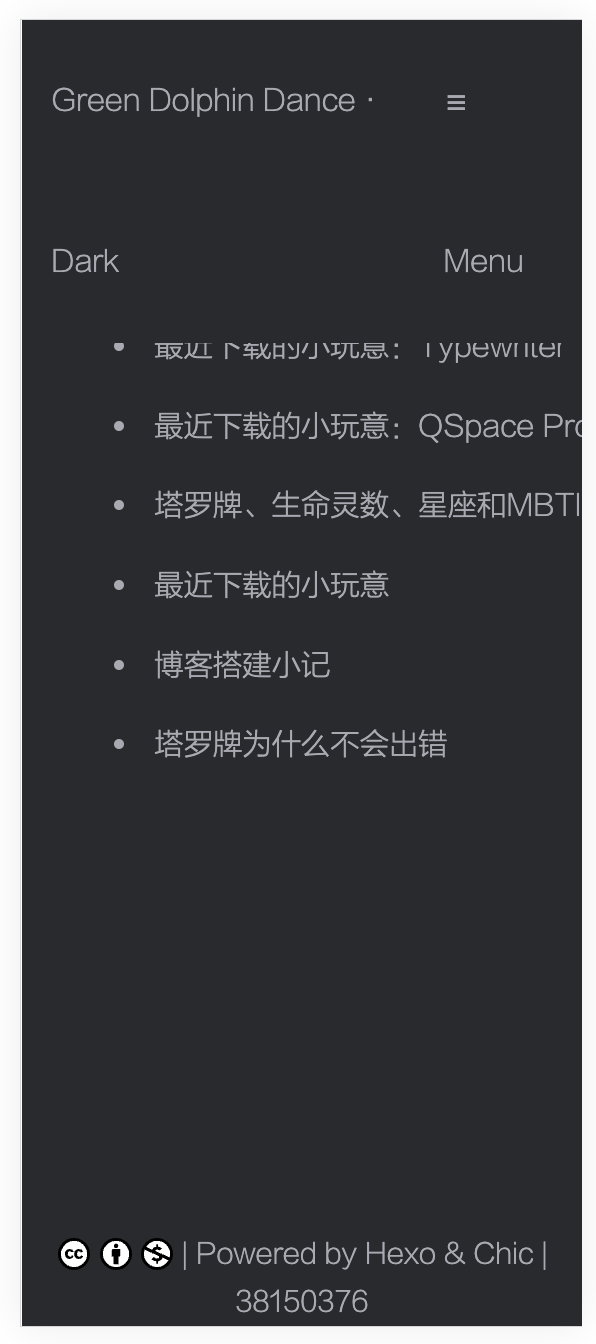
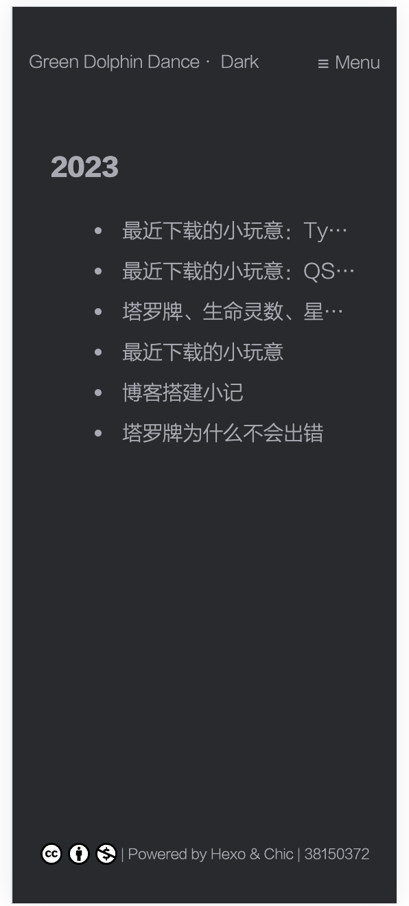
Archive页面过长博文名省略:在博文名过长的时候将其省略,省略的部分用“…”表示。
Categories页面过长博文名省略:与上一个教程大同小异,只是调整的是Categories页面。
添加Emoji支持:添加Emoji😈支持。
添加文章字数和阅读时长:如题。
谷歌收录:将博客部署到搜索引擎如Google上使得其能被搜索到。
打赏:如题,我暂时用不到,先存在这里。
文章置顶:也暂时用不到,先存在这里。
过长博文名省略
(2023-12-5更新)发现按照上面的教程操作,只有桌面端的博文名省略了,移动端依旧会超过屏幕。所以修改插入到archive.ejs中的代码如下:
@media screen and (min-width: 769px){
li {
width: 650px;
height: 29.5px;
white-space: nowrap;
overflow: hidden;
text-overflow: ellipsis;
}
}
@media screen and (max-width: 768px) {
li {
width: 285px;
height: 29.5px;
white-space: nowrap;
overflow: hidden;
text-overflow: ellipsis;
}
}
|
但在“分类”页面中,某些设备不显示省略号,不知何故。
(2023-12-7更新)知道是什么原因了。解决方法是微调参数。我将tag和archive页面的min-width改为768px,max-width改为767px,然后把大屏幕下的width改为600px,小屏幕下的width改为240px,问题解决。至于categories页面,我直接把所有屏幕尺寸的宽度调成了240px。
(2024-5-3更新)发现大屏幕上每一个category的子页面上,宽度仍然是240px,不美观。于是修改category.ejs代码如下:
<style>
    li {
        height: 24.2px;
        white-space: nowrap;
        overflow: hidden;
        text-overflow: ellipsis;
    }

    @media screen and (max-width: 767px) {
        li {
            width: 240px;
        }
    }

    @media screen and (min-width: 768px) {
        li {
            width: 60vw;
        }
    }
</style>
|
置顶
教程见上。但我发现教程缺少了一步,就是把主题文件夹下的_config.yml中“归档”按钮的跳转链接改掉:
但是这样一来,归档页面的链接就会变成https://greendolphindance.com/top/了,有点不爽。解决方法如下。首先top.js的内容改成:
var pagination = require('hexo-pagination');
hexo.extend.generator.register('top', function (locals) {
let allPost = locals.posts;
return pagination('/archives', allPost, {
perPage: this.config.top_generator.per_page,
layout: ['top', 'archive', 'index'],
format: 'page' + '/%d/',
data: {
__index: true
}
});
});
|
然后用top.ejs里的内容替换掉archive.ejs里的内容,并在“pagination”位置作如下修改:
<nav class="pagination">
<%- paginator({ prev_next: false, end_size: 1, mid_size: 2, format: 'page/%d/' ,
total: Math.ceil(posts.length / perPage) }) %>
</nav>
|
除此之外,由于我限定了桌面端li的宽度为650px,这会导致置顶栏的显示错位,于是修改CSS代码如下:
@media screen and (min-width: 769px) {
li {
width: 650px;
height: 29.5px;
white-space: nowrap;
overflow: hidden;
text-overflow: ellipsis;
}
}
@media screen and (max-width: 768px) {
li {
width: 285px;
height: 29.5px;
white-space: nowrap;
overflow: hidden;
text-overflow: ellipsis;
}
}
.top-item-date {
float: right;
text-align: right;
color: #a9a9b3;
}
.top-item {
margin-left: 2rem;
line-height: 2em;
margin-bottom: 10px;
}
|
修bug
设置完毕发现过长博文名省略被我覆盖掉了……于是改了archive.ejs的代码。修改后的完整代码如下:
<div class="container top">
<div class="post-wrap tags top">
<h2 class="post-title top">- 文章 -</h2>
<br>
<div class="post top">
<hr />
<h3>置顶</h3>
<%site.tags.forEach(item=>{%>
<% if(item.name=="置顶" ){ %>
<% item.posts.each(function (post) { %>
<% if(post.top){ %>
<article class="top-item">
<a class="top-item-link" href="<%- url_for(post.path) %>">
<li>
<%= post.title %>
<span class="top-item-date"><%- date(post.date, theme.date_format) %></span>
</li>
</a>
</article>
<% ;} %>
<% }) %>
<% ;} %>
<% }) %>
<hr />
</div>
<% var perPage=config.top_generator.per_page %>
<% var currentPage=url.match(/page\/(.*)\//) ? url.match(/page\/(.*)\//)[1] : 1 %>
<% var last_year='' ; %>
<% var posts=site.posts %>
<% posts.data=posts.data.sort((a, b)=> b.date - a.date) %>
<% posts.slice((currentPage - 1) * perPage, currentPage * perPage ).each(function (post) { %>
<% var cur_year=post.date.year(); %>
<% if(last_year !==cur_year){ %>
<h3><%- cur_year %></h3>
<% last_year=cur_year; } %>
<article class="archive-item">
<a class="archive-item-link" href="<%- url_for(post.path) %>">
<li class="title">
<%= post.title %>
</li>
</a>
<span class="archive-item-date"><%- date(post.date, theme.date_format) %></span>
</article>
<% }) %>
<% if(Math.ceil(posts.length / perPage)> 1) { %>
<nav class="pagination">
<%- paginator({ prev_next: false, end_size: 1, mid_size: 2, format: 'page/%d/' , total:
Math.ceil(posts.length / perPage) }) %>
</nav>
<% } %>
</div>
</div>
<style>
@media (min-width: 769px) {
.title {
width: 650px;
height: 29.5px;
white-space: nowrap;
overflow: hidden;
text-overflow: ellipsis;
}
}
@media (max-width: 768px) {
.title {
width: 60vw !important;
height: 29.5px;
white-space: nowrap;
overflow: hidden;
text-overflow: ellipsis;
}
}
.top-item-date {
float: right;
text-align: right;
color: #a9a9b3;
}
.top-item {
margin-left: 2rem;
line-height: 2em;
margin-bottom: 10px;
}
</style>
|
长链接
这篇博文里有一些很长的链接。这些链接,尤其在移动端的时候,无法自动断行,导致页面被撑开,很丑。
我首先在post_content.styl里加入如下代码:
.break-link
    overflow-wrap break-word
    word-break break-all
|
然后将长链接两端分别加上“<a class=”break-link”>”和“</a>”。有效,但是会导致该链接显示为链接样式(淡蓝色、下划线),而我不希望它如此显示。于是又在post_content.styl里加入:
.no-style
    color inherit
    text-decoration none
|
再把长链接的class改成“break-link no-style”。问题解决。以后如果想要链接断行,同时让其也显示成链接样式的话,class里不写no-style即可。
文章目录
参考的是这个教程。之前也试过别的教程,失败了。这个能用。配置很简单。但是直接设置,这个目录是无法点击跳转的,需要再加一些话:
toc:
  maxdepth: 3
  class: toc
  slugify: transliteration
  decodeEntities: false
  anchor:
    position: before
    symbol: ''
    style: header-anchor
|
这样即可。
进阶
觉得目录作为文章的内容不太方便,于是去GitHub上提了issue,希望主题的开发者能够实现相关功能。开发者推荐了tocbot这个插件。配置过程如下:
在post.ejs里添加了如下代码:
<div class="js-toc"></div>
<div class="post-content">
</div>
|
然后在layout.ejs里添加了如下代码:
<link rel="stylesheet" href="https://cdn.jsdelivr.net/npm/tocbot/dist/tocbot.css" />
<script src="https://cdn.jsdelivr.net/npm/tocbot/dist/tocbot.js"></script>
    <script>
        document.addEventListener('DOMContentLoaded', (event) => {
            tocbot.init({
                tocSelector: '.js-toc',
                contentSelector: '.post-content',
                headingSelector: 'h1, h2, h3, h4',
            });
        });
    </script>
|
最后在media.styl里添加了如下代码:
@media screen and (max-width: 1279px) // 最大宽度1279px时应用这条规则。(最大宽度小于1279px返回false,屏蔽规则。)
.post-toc
display none
.js-toc {
position: fixed;
top: 150px;
right: 20px;
width: 150px;
overflow-y: visible;
max-height: 500px;
padding: 20px;
background-color: transparent;
z-index: 1000;
}
.toc-link {
display: flex;
align-items: center;
}
.toc-link::before {
content: "";
height: 1em;
margin-right: 10px;
margin-top: 0.2em;
margin-bottom: 0.2em;
}
.toc-list li {
list-style-type: none;
}
.toc-link::before {
display: none !important;
}
|
至于为什么是media.styl而不是别的,我也不知道,随便选了一个罢了。
这样实现的目录有点丑,不过我尽力了,以后再来修改。
然后还想让目录在手机和平板上不显示,这个简单,在media.styl里添加
@media screen and (max-width: 1280px) {
.js-toc {
display: none;
}
}
|
即可。
2023-10-18更新:今天修改了,扒了主题设计者Demo网站上的源代码。修改后的完整代码如下:
@media screen and (max-width: 1279px) // 最大宽度1279px时应用这条规则。(最大宽度小于1279px返回false,屏蔽规则。)
.post-toc
display none
.js-toc {
position: fixed;
top: 95px;
right: 2em;
width: 15rem;
font-size: 0.75rem
overflow-y: visible;
max-height: 500px;
background-color: transparent;
z-index: 1000;
}
.js-toc .tocbot-list {
max-height: 450px;
max-width: 250px;
overflow: auto;
position: relative;
padding-right: 0.875rem;
}
.js-toc .tocbot-list::-webkit-scrollbar {
width: 6px;
height: 6px;
}
.js-toc .tocbot-list::-webkit-scrollbar-thumb {
width: 6px;
background-color: #eee;
border-radius: 2px;
}
.js-toc .tocbot-list ul {
list-style: none;
position: inherit;
overflow: hidden;
}
.js-toc .tocbot-list ul li {
margin-left: 0.25rem;
}
.js-toc .toc-link::before {
background-color: #fff;
}
.js-toc .is-active-link::before {
background-color: #2d96bd;
}
.js-toc .tocbot-list-menu {
margin: 1rem 0.75rem;
font-size: 0.75rem;
}
.js-toc .tocbot-list-menu a {
display: block;
margin: 0.375rem 0;
color: #999;
cursor: pointer;
}
.js-toc .tocbot-list-menu a:hover {
color: #808080;
}
.toc{overflow-y:auto}.toc>.toc-list{overflow:hidden;position:relative}.toc>.toc-list li{list-style:none}.toc-list{margin:0;padding-left:10px}a.toc-link{color:currentColor;height:100%}.is-collapsible{max-height:1000px;overflow:hidden;transition:all 300ms ease-in-out}.is-collapsed{max-height:0}.is-position-fixed{position:fixed !important;top:0}.is-active-link{font-weight:700}.toc-link::before{background-color:#EEE;content:' ';display:inline-block;height:inherit;left:0;margin-top:-1px;position:absolute;width:2px}.is-active-link::before{background-color:#54BC4B}
@media screen and (max-width: 1280px) {
.js-toc {
display: none;
}
}
.back-top-large {
display: none;
}
@media (min-width: 1281px) {
.back-top-small {
display: none;
}
.back-top-large {
display: block;
}
}
|
移动端目录
这篇文章越来越长,在移动端阅读感觉很费劲。想着要是把这个目录在移动端也实现就好了。想了一个简单的思路,在移动端右下角放一个目录图标,点击展开目录,再点击图标或点击页面空白部分收起目录。下面是GPT的实现:
首先在post.ejs里添加:
<button id="tocButton">
    <svg t="1697879152903" class="icon" viewBox="0 0 1024 1024" version="1.1" xmlns="http://www.w3.org/2000/svg" p-id="5387" width="32" height="32">
        <path d="M 863.113 0 H 160.887 A 161.064 161.064 0 0 0 0 160.887 v 702.225 a 161.064 161.064 0 0 0 160.887 160.887 h 702.225 a 161.064 161.064 0 0 0 160.887 -160.887 V 160.887 a 161.064 161.064 0 0 0 -160.887 -160.887 Z M 242.94 725.908 h -6.06545 a 24.1331 24.1331 0 0 1 0 -48.2662 H 242.94 a 24.1331 24.1331 0 0 1 0 48.2662 Z m 0 -193.58 h -6.06545 a 24.1331 24.1331 0 0 1 0 -48.2662 H 242.94 a 24.1331 24.1331 0 0 1 0 48.2662 Z M 242.94 333.037 h -6.06545 a 24.1331 24.1331 0 0 1 0 -48.2662 H 242.94 a 24.1331 24.1331 0 0 1 0 48.2662 Z m 534.146 392.839 H 416.087 a 24.1331 24.1331 0 0 1 0 -48.2662 h 360.854 a 24.1331 24.1331 0 0 1 0 48.2662 Z m 0 -193.58 H 416.087 a 24.1331 24.1331 0 0 1 0 -48.2662 h 360.854 a 24.1331 24.1331 0 0 1 0 48.2662 Z M 777.086 333.037 H 416.087 a 24.1331 24.1331 0 0 1 0 -48.2662 h 360.854 a 24.1331 24.1331 0 0 1 0 48.2662 Z" fill="#8a8a8a" p-id="5388"></path>
    </svg>
</button>
<div class="overlay" id="overlay"></div>

<script>
document.getElementById('tocButton').addEventListener('click', function() {
    var toc = document.querySelector('.js-toc');
    var overlay = document.getElementById('overlay');
    if (toc.style.display === 'none' || toc.style.display === '') {
        toc.style.display = 'block';
        overlay.style.display = 'block';
    } else {
        toc.style.display = 'none';
        overlay.style.display = 'none';
    }
});

document.getElementById('overlay').addEventListener('click', function() {
    document.querySelector('.js-toc').style.display = 'none';
    document.getElementById('overlay').style.display = 'none';
});
</script>
|
然后在media.styl里设定样式:
@media screen and (min-width: 1280px) {
.js-toc {
position: fixed;
top: 140px;
right: 2em;
width: 13rem;
font-size: 0.75rem
overflow-y: auto !important;
max-height: 500px;
background-color: transparent;
z-index: 1000;
}
}
.js-toc .tocbot-list {
max-height: 450px;
max-width: 250px;
overflow: auto;
position: relative;
padding-right: 0.875rem;
}
.js-toc .tocbot-list::-webkit-scrollbar {
width: 6px;
height: 6px;
}
.js-toc .tocbot-list::-webkit-scrollbar-thumb {
width: 6px;
background-color: #eee;
border-radius: 2px;
}
.js-toc .tocbot-list ul {
list-style: none;
position: inherit;
overflow: hidden;
}
.js-toc .tocbot-list ul li {
margin-left: 0.25rem;
}
.js-toc .toc-link::before {
background-color: #fff;
}
.js-toc .is-active-link::before {
background-color: #2d96bd;
}
.js-toc .tocbot-list-menu {
margin: 1rem 0.75rem;
font-size: 0.75rem;
}
.js-toc .tocbot-list-menu a {
display: block;
margin: 0.375rem 0;
color: #999;
cursor: pointer;
}
.js-toc .tocbot-list-menu a:hover {
color: #808080;
}
.toc{overflow-y:auto}.toc>.toc-list{overflow:hidden;position:relative}.toc>.toc-list li{list-style:none}.toc-list{margin:0;padding-left:10px}a.toc-link{color:currentColor;height:100%}.is-collapsible{max-height:1000px;overflow:hidden;transition:all 300ms ease-in-out}.is-collapsed{max-height:0}.is-position-fixed{position:fixed !important;top:0}.is-active-link{font-weight:700}.toc-link::before{background-color:#EEE;content:' ';display:inline-block;height:inherit;left:0;margin-top:-1px;position:absolute;width:2px}.is-active-link::before{background-color:#54BC4B}
.toc-list li {
list-style-type: none;
}
@media screen and (max-width: 1279px) {
#tocButton {
display: block;
position: fixed;
bottom: 20px;
right: 5vw+1.5px;
z-index: 1001;
width: 32px;
height: 32px;
background-color: transparent;
border: none;
}
.overlay {
display: none;
position: fixed;
top: 0;
left: 0;
width: 100%;
height: 100%;
background-color: rgba(0, 0, 0, 0.7);
z-index: 999;
}
.js-toc {
position: fixed;
top: 50%;
left: 50%;
transform: translate(-50%, -50%);
z-index: 1000;
background-color: white !important;
border-radius: 5px;
padding: 10px;
display: none;
max-width: 85vw;
min-width: 60vw;
max-height: 70vh;
overflow-y: auto !important;
}
body.dark-theme .js-toc {
background-color: #292a2d !important;
}
}
@media screen and (min-width: 1280px) {
#tocButton {
display: none !important;
}
}
|
目录为空时不显示目录图标
实现代码如下:
<script>
window.onload = function() {
var toc = document.querySelector('.js-toc');
var tocButton = document.getElementById('tocButton');
if (toc) {
if (toc.innerText.trim() === '') {
tocButton.style.display = 'none';
} else {
tocButton.style.display = 'block';
}
} else {
tocButton.style.display = 'none';
}
};
</script>
|
在目录打开时禁用页面的滚动
GPT生成了代码,并建议我合并一些事件监听器以使得代码整洁。以下是合并后的代码:
document.getElementById('tocButton').addEventListener('click', function() {
var toc = document.querySelector('.js-toc');
var overlay = document.getElementById('overlay');
var body = document.body;
if (toc.style.display === 'none' || toc.style.display === '') {
toc.style.display = 'block';
overlay.style.display = 'block';
body.style.overflow = 'hidden';
} else {
toc.style.display = 'none';
overlay.style.display = 'none';
body.style.overflow = '';
}
});
document.getElementById('overlay').addEventListener('click', function() {
document.querySelector('.js-toc').style.display = 'none';
document.getElementById('overlay').style.display = 'none';
document.body.style.overflow = '';
});
window.onload = function() {
var toc = document.querySelector('.js-toc');
var tocButton = document.getElementById('tocButton');
if (toc) {
tocButton.style.display = toc.innerText.trim() === '' ? 'none' : 'block';
} else {
tocButton.style.display = 'none';
}
};
|
允许垂直滚动
发现在移动端滑动手指,目录不滚动。解决办法是修改overflow-y的值:
overflow-y: auto !important;
|
这样即可。
垂直滚动的下限(?)
垂直滚动到底部时,本来理想的情况是目录文字的最后一行滑到底边框的上面一点点,就不能滑动了。但实际上还能滑动,一直滑到整个目录框变成空白(内容全部滑上去了),才不能滑动。
解决方案是在layout.ejs里添加如下代码(我一开始添加到post.ejs里,结果没有被调用?):
<script>
document.querySelector('.js-toc').addEventListener('scroll', function(e) {
var tocList = document.querySelector('.toc-list');
var maxHeight = tocList.scrollHeight - this.clientHeight + 20;
if (this.scrollTop >= maxHeight) {
this.scrollTop = maxHeight;
}
});
</script>
|
更新:放弃了这个功能,因为这样的话,当目录内容到达最底部不能再滑动时,右边的滑块还在中间,这个我不知道怎么解决。
再更新:突然灵光一闪,我让滑块不显示不就可以了吗?反正感觉很多可以滑动的东西都不会显示滑块啊。说干就干:
.js-toc::-webkit-scrollbar {
display: none;
}
.js-toc {
-ms-overflow-style: none;
}
.js-toc {
scrollbar-width: none;
}
|
搞定。我可真他妈是个天才!
“目录”按钮和“回到顶部”按钮垂直对齐
这个也折腾了好久。明明两个东西right的数值设置成了一样的,但是总是对不齐。一开始GPT给的方案是弄一个,叫什么,Flexbox?就是把“目录”和“回到顶部”包裹到同一个类里面去,再设定两者的相对位置。但是不知道为什么,调了很久都不行。
然后看网页检查器找线索,发现鼠标放在Element中“totop”这个类时,网页中被标示出来的区域和“目录”按钮的实际位置有错位。而我是把“totop”这个类和“目录”按钮对齐的,所以造成实际显示效果没有对齐。
经查,鼠标放在“totop”下面的SVG链接时,页面上标示的区域和“目录”按钮是重叠的。于是在layout.ejs增加代码如下:
<style>
#tocButton svg {
position: fixed;
bottom: 20px;
right: 5vw;
}
#totop {
position: fixed;
bottom: 20px+2rem;
right: 5vw;
}
</style>
|
问题解决。我还做了一些小的调整,比如调整某些情况下“回到顶部”按钮的大小。
修改完之后觉得两个按钮距离太近了,就改了#totop中bottom的数值,但是没有反应。经查,这一条规则没有被应用,被应用的是“totop”类中的bottom规则。于是把这一数值由50px改为60px。
桌面端点击目录时疯狂上下抖动!
如题,死马当活马医地问了一下GPT,结果轻松就解决了!方法如下:
这个问题可能是由于浏览器尝试在点击目录条目时保持目录的当前滚动位置所导致的。当页面内容滚动以将所选条目对齐到视口顶部时,目录的滚动位置也会相应地调整,从而导致“疯狂上下抖动”的现象。
为了解决这个问题,你可以尝试在点击目录条目时禁用目录的滚动事件监听器,然后在跳转完成后再重新启用。这里是一个可能的解决方案:
<script>
var tocContainer = document.querySelector('.js-toc');
tocContainer.addEventListener('scroll', handleScroll);
function handleScroll(e) {
}
tocContainer.addEventListener('click', function(e) {
tocContainer.removeEventListener('scroll', handleScroll);
setTimeout(function() {
tocContainer.addEventListener('scroll', handleScroll);
}, 100);
});
</script>
|
在这段代码中,我添加了一个点击事件监听器,当点击目录条目时,它会禁用滚动事件监听器,然后在一个延迟后重新启用。这样可以防止在跳转过程中触发滚动事件,从而避免抖动的问题。
你可以尝试使用这段代码,并根据你的实际情况进行相应的调整。希望这能解决你的问题!
2023-10-22更新:发现没解决,我是用Chrome看到仿佛解决了,但是Chrome上其实根本就没有这个问题……只有Safari有。上面这段代码需要把原来的滚动事件处理代码放进handleScroll这个函数里,我当时没看直接复制了,所以其实根本没用。然后今天我找了半天找不到这个滚动代码……所以暂时算了吧。
点框外屏幕时隐藏目录
默认的设定是在目录展开时,只有再次点击目录按钮才会收起目录,但是这样有点反直观。所以我想设置成在目录展开时,点击屏幕除目录框之外的任何地方都可以将目录收起。实现方法如下:
我明白了,我将详细说明应该如何修改代码:
1. 添加新函数 hideToc():
在 <script> 标签内,你可以添加一个新函数 hideToc()。这个函数会隐藏目录和遮罩层,并启用页面滚动。
2. 修改 overlay 的 HTML:
在 overlay div 的 HTML 中添加一个 onclick 事件,使其在被点击时调用 hideToc() 函数。
修改 tocButton 的点击事件监听器,使其在目录显示时调用 hideToc() 函数。
以下是具体的代码修改:
1. 在 <div class="overlay" id="overlay"></div> 下面添加 onclick 事件:
<div class="overlay" id="overlay" onclick="hideToc()"></div>
|
2. 在现有 <script> 标签内添加新函数 hideToc():
<script>
function hideToc() {
var toc = document.querySelector('.js-toc');
var overlay = document.getElementById('overlay');
var body = document.body;
toc.style.display = 'none';
overlay.style.display = 'none';
body.style.overflow = '';
}
</script>
|
找到以下代码:
document.getElementById('tocButton').addEventListener('click', function() {
var toc = document.querySelector('.js-toc');
var overlay = document.getElementById('overlay');
var body = document.body;
if (toc.style.display === 'none' || toc.style.display === '') {
toc.style.display = 'block';
overlay.style.display = 'block';
body.style.overflow = 'hidden';
} else {
toc.style.display = 'none';
overlay.style.display = 'none';
body.style.overflow = '';
}
});
|
并将其修改为:
document.getElementById('tocButton').addEventListener('click', function() {
var toc = document.querySelector('.js-toc');
var overlay = document.getElementById('overlay');
var body = document.body;
if (toc.style.display === 'none' || toc.style.display === '') {
toc.style.display = 'block';
overlay.style.display = 'block';
body.style.overflow = 'hidden';
} else {
hideToc();
}
});
|
这样,无论是点击目录按钮还是页面的其他部分,目录都应该能够正确显示和隐藏。
目录各条目的间距
我希望目录框里,每个条目之间有0.5rem的间距。实现方式:
li.toc-list-item {
margin-bottom: 0.5rem;
}
|
代码整理
其实我也不记得我是怎么整理的了,总之记录一下我确实有整理过这回事……
起因是突然发现在宽度大于等于1280px的页面也会显示目录按钮,也会出现展开的目录。点击按钮会隐藏目录,再点击会显示目录,然后页面就不能滚动了。总之肯定是哪里搞错了,于是开始逐一排查,期间听从GPT的建议整理了大量代码。记得的操作有:
- 把同一个函数写了两遍的内容合并到一起。
- 调整边界数值。比如我一开始自己也没搞清自己到底是要宽度大于1280还是大于等于1280,所以写得很混乱。后来统一成了min-width为1280(后改成1380)和max-width为1279(后改成1379)。
- 调整缩进。由于我很多代码是复制来的,有时候原网页上没有缩进或缩进不对,所以这些缺陷全被我继承过来了……
- 想起来了再补充。
整理的过程中,有一次编译后等了很久网站也没有变化,经查,在文件里已改成“1279”的数值,在网页检查器中仍是“1280”,其他修改过的属性也没有变化。我思考了很久……花了很多时间,查了很多资料,使用了很多方法,包括删库重建,均无效果。最后发现我之前用博客文件夹的本地备份替换了原来的文件夹(方式是删除原文件夹,再重命名备份文件夹),而这之后必须在终端里重新cd一下,做的更改才可以成功生效。下次一定记住……
优化宽度<300px的手机上的显示
不多说,放代码。代码放在media.styl里。
@media (max-width: 299px) {
.wrapper header .navbar-header,
.wrapper header .navbar-header a,
.menu-toggle {
font-size: 12px !important;
}
.wrapper footer .copyright,
.wrapper footer .copyright * {
font-size: 10px !important;
}
.wrapper .nickname {
font-size: 20px !important;
}
.wrapper .description {
font-size: 12px !important;
}
}
@media (max-width: 299px) {
body:not(.wrapper) .navbar-header,
body:not(.wrapper) .navbar-header * {
font-size: 12px !important;
}
body:not(.wrapper) footer .copyright,
body:not(.wrapper) footer .copyright * {
font-size: 10px !important;
}
}
@media (max-width: 299px) {
.menu.active .menu-item {
font-size: 12px !important;
}
}
@media (max-width: 299px) {
.post-wrap {
padding-top: 2rem;
width: 80%;
overflow: hidden;
}
}
@media (max-width: 299px) {
.archive-item-link {
display: block;
overflow: hidden;
white-space: nowrap;
text-overflow: ellipsis;
width: 100%;
}
}
@media (max-width: 299px) {
li {
width: 100% !important;
}
}
@media (max-width: 299px) {
.post-wrap .post-title {
font-size: 1.5em;
}
}
|
总之就是各种调整各种打补丁……
调整前示例:
调整后示例:
还是有点丑,不过我尽力了。希望看我博客的没有Galaxy Fold用户……这是什么反人类手机啊。
解决点击“About”和“Links”时页面微妙的横向晃动
又是一个微小的细节!但是一旦注意到就忍不了!
解决方案很简单,在CSS文件中添加如下代码:
body {
width: 100vw;
overflow-x: hidden;
}
|
即可。
页面标题对齐
今天发现Categories和Tags页面、About和Links页面、文章的标题不在同一高度上。我希望把它们全部调整成和Categories与Tags的标题等高(从网页检查器得知需要设置margin-top为2rem)。
About和Links页面标题的高度在/themes/Chic/source/css/_page/page.styl中调整,将padding-top改为2rem即可。
文章标题的高度在 /themes/Chic/source/css/_page/_post/post_header.styl 中调整,需要进行两步操作:(1)将post-title的margin-top设置为2rem;(2)将post-header h1下的“margin 0 !important”删除,否则标题高度将不会发生变化。
但是,我没有改Archives页面标题的高度,即便这一页面的标题比其他的标题位置高。因为(1)Archives中的标题“2023”字号比其他页面标题的字号小,那么将前者与页面其他内容排列得更紧凑似乎要美观一些。(2)其实Archives标题的padding-top也是2rem,但是它可能是按这个标题的字号计算的,所以这个2rem的绝对长度比别的页面的2rem要短;然后我懒得计算它们的绝对高度了,所以就算了吧。
浏览器顶栏的标题显示
所谓的浏览器顶栏,就是这个栏,我也不知道学名应该叫什么:
在修改之前,顶栏标题中“|”前面的内容都乱七八糟的,有“归档”、“Categories”、“- 关于我 -”之类的。于是想把它们统一起来。
首先了解到顶栏标题和md文件的title有关,于是把分类和留言板等的title改成了中文,显示正常。但是由于Chic主题默认的分类和标签页面的标题是左右带“-”的,我就把关于和友链页面的title改成了“- 关于我 -”和“- 友情链接 -”,这样顶栏标题也是带“-”的,不统一。
修改方法如下:首先在md文件的FrontMatter中添加一个新的变量,如:
title: "- 关于我 -"
browser_title: "关于"
|
然后找到负责渲染页面标题的模板文件(我的是/themes/Chic/layout/_partial/head.ejs),修改这段代码:
<title><% if (title){ %><%= title %> | <% } %><%= config.title %></title>
|
如下:
<title><% if (page.browser_title){ %><%= page.browser_title %> | <% } else if (title){ %><%= title %> | <% } %><%= config.title %></title>
|
即可。
分类和标签页面的排序
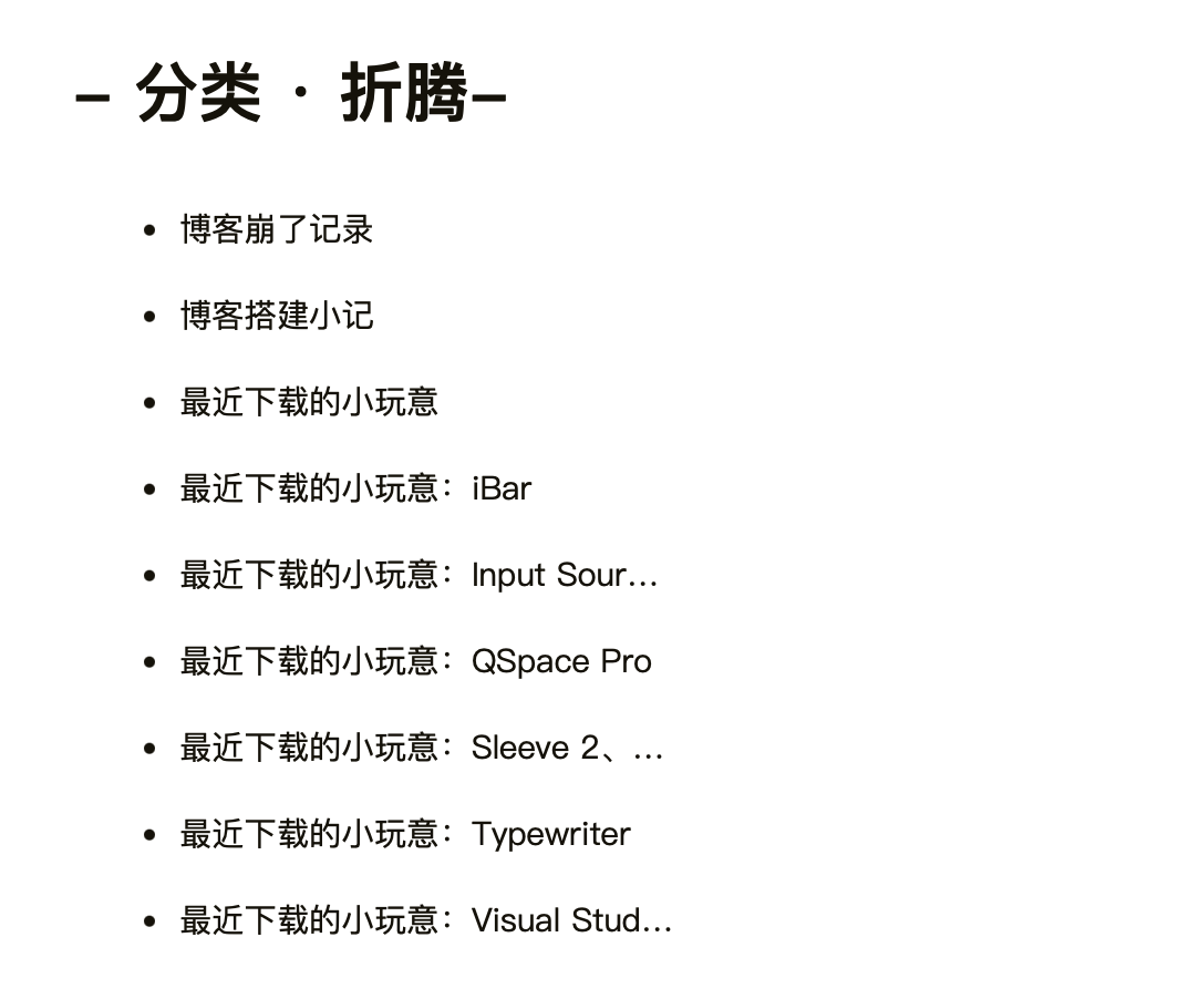
(2023-12-11更新)首先说明一下这两个页面的结构。分类主页面如下图所示:
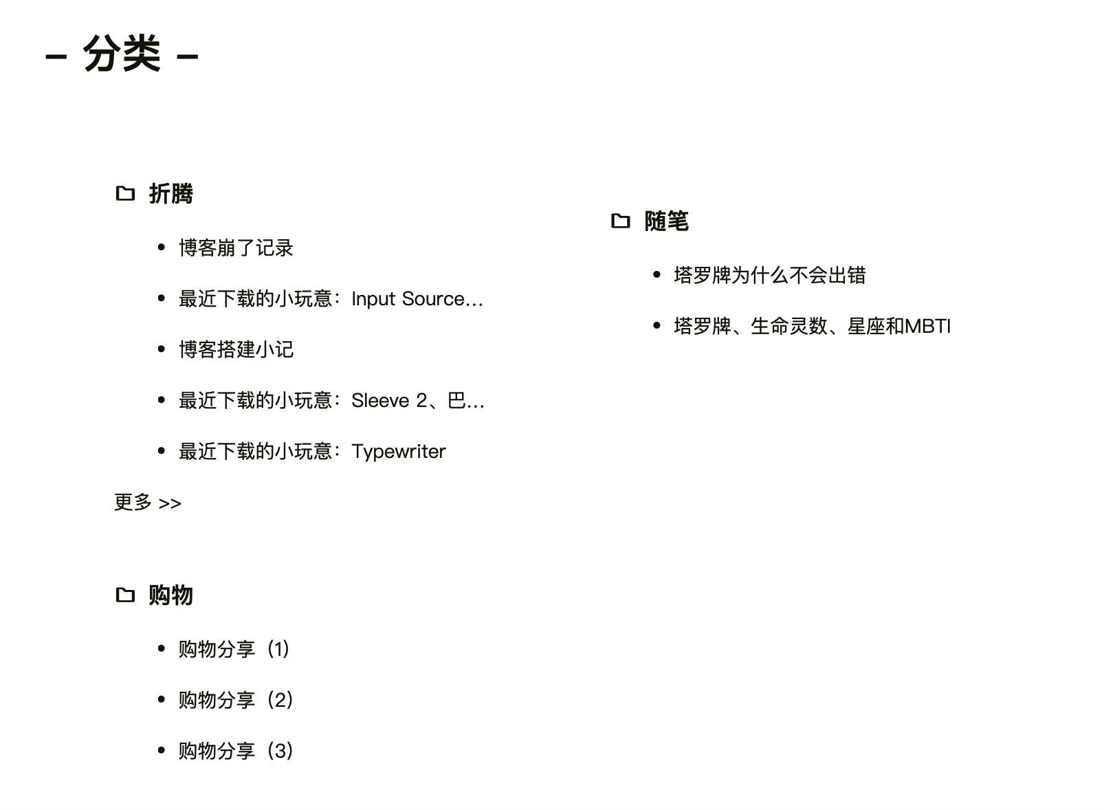
其中,“折腾”“随笔”等分类名都可以点开,点开后出现如下界面:
我希望主页面的各个分类、各个分类下的文章名,以及点开某个分类后其下的文章名,都按字母顺序排列。
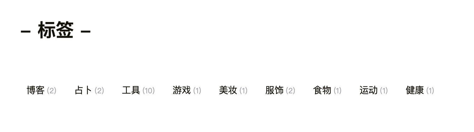
标签主页面如下图所示:
其中,点开任意标签可以进入类似如下的界面:
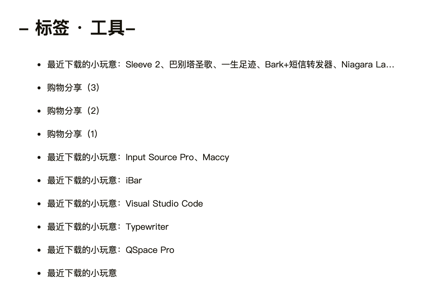
我希望每个标签,以及点开某个标签后其下的文章名,都按字母顺序排列。
分类
这个事情的本质是让categories页面的每个card-item按照其下h3的文本的字母顺序排列。ChatGPT解决方案的原理是:
为了让 categories 页面的每个 card-item 按照其下 h3 标签的文本(即分类名称)的字母顺序排列,您需要在循环之前对 site.categories 进行排序。
给出的代码如下,修改后blog/themes/Chic/layout/category.ejs中的代码如下:
<%# single category page %>
<% if(is_category()){ %>
<%- partial('_page/category', {pagination: config.category, index: true}) %>
<% }else{ %>
<div class="container">
<div class="post-wrap categories">
<h2 class="post-title">- 分类 -</h2>
<div class="categories-card">
<%
// Convert categories to an array and sort them alphabetically by name
var sortedCategories = site.categories.toArray().sort((a, b) => a.name.toLowerCase().localeCompare(b.name.toLowerCase()));
%>
<% sortedCategories.forEach(category_item => { %>
<div class="card-item">
<div class="categories">
<a href="<%- url_for(category_item.path) %>">
<h3>
<i class="iconfont icon-category" style="padding-right:3px"></i>
<%- category_item.name %>
</h3>
</a>
<% category_item.posts.forEach((post_item, index = 0) => { %>
<% if(++index <= 5){ %>
<article class="archive-item">
<a class="archive-item-link" href="<%- url_for(post_item.path) %>">
<li><%- post_item.title %></li>
</a>
</article>
<% } %>
<% }) %>
<% if(category_item.posts.length > 5){ %>
<a class="more-post-link" href="<%- url_for(category_item.path) %>">更多 >></a>
<% } %>
</div>
</div>
<% }) %>
</div>
</div>
</div>
<% } %>
<style>
</style>
|
各分类下的文章标题
这个需要在blog/themes/Chic/layout/_page/category.ejs中进行修改。修改后改文件的代码如下:
<%# single category page%>
<div class="container">
<div class="post-wrap categories">
<h2 class="post-title">- <i class="iconfont icon-fenlei" style="font-size: 1em;"></i>分类 · <%-page.category%>-</h2>
<% var posts = site.categories.findOne({name: page.category}).posts %>
<% posts.data.sort((a, b) => a.title.toLowerCase().localeCompare(b.title.toLowerCase())) %>
<% posts.each(function (post) { %>
<article class="archive-item">
<a class="archive-item-link" href="<%- url_for(post.path) %>">
<li class="category-page-post">
<%= post.title %>
</li>
</a>
</article>
<% }) %>
</div>
</div>
|
标签
类似地,标签本身的顺序在blog/themes/Chic/layout/tag.ejs里改,点开每个标签后列表文章的排列顺序在blog/themes/Chic/layout/_page/tag.ejs里改。修改后,第一个文档里的代码如下:
<%#
this page will judge whether current page is 'tag.'
url:'http://localhost:4000/tag/' return false.
url:'http://localhost:4000/tags/test/' return true.
if you enter 'tag' page by click link will show all tags.
otherwise if you enter 'tags' by click post header link will show the single tag of this post.
how to add a tag page:
1. hexo new page "tag"
2. cd source/tag/index.md
3. add layout pattern like this:
---
title: '''tag'''
date: 2019-06-09 09:56:49
layout: tag
---
%>
<% if(is_tag()){ %>
<%- partial('_page/tag', {pagination: config.tag, index: true}) %>
<% }else{ %>
<div class="container">
<div class="post-wrap tags">
<h2 class="post-title">- 标签 -</h2>
<div class="tag-cloud-tags">
<%
// Convert tags to an array and sort them alphabetically by name
var sortedTags = site.tags.toArray().sort((a, b) => a.name.toLowerCase().localeCompare(b.name.toLowerCase()));
%>
<% sortedTags.forEach(function(tag) { %>
<a href="<%- url_for(tag.path) %>"><%- tag.name %><small>(<%- tag.length %>)</small></a>
<% }); %>
</div>
</div>
</div>
<% } %>
|
第二个文档里的则如下:
<%# single tag page %>
<div class="container">
<div class="post-wrap tags">
<h2 class="post-title">- <i class="iconfont icon-biaoqian" style="font-size: 1em;"></i>标签 · <%-page.tag%>-</h2>
<% var posts = site.tags.findOne({name: page.tag}).posts %>
<% posts.data.sort((a, b) => a.title.toLowerCase().localeCompare(b.title.toLowerCase())) %>
<% posts.each(function (post) { %>
<article class="archive-item">
<a class="archive-item-link" href="<%- url_for(post.path) %>">
<li class="tag-page-post">
<%= post.title %>
</li>
</a>
</article>
<% }) %>
</div>
</div>
<style>
@media screen and (min-width: 768px){
li {
width: 600px;
height: 29.5px;
white-space: nowrap;
overflow: hidden;
text-overflow: ellipsis;
}
}
@media screen and (max-width: 767px) {
li {
width: 285px;
height: 29.5px;
white-space: nowrap;
overflow: hidden;
text-overflow: ellipsis;
}
}
</style>
|
本站运行时间
参考的是这个教程,很简单。
最后更新时间
部分参考了这个教程(虽然ta和我用的主题不一样)。
首先修改blog/scaffolds/post.md。在frontmatter里添加一行:
然后每修改一次文章内容,都要手动修改一下updated后面的时间(好麻烦)。
接着修改blog/themes/Chic/layout/_page/post.ejs,增加下面一段:
<% if(page.updated){ %>
<span class="updated-time">
最后更新: <a href="#"><%- date(page.updated, theme.date_format) %> <%- time(page.updated, theme.time_format)%></a>
</span>
<% } %>
|
即可。
代码复制按钮
首先去GitHub下载clipboard.js文件。将dist/clipboard.min.js放入博客主题目录下的source/js文件夹中。
然后在post.ejs中插入如下代码:
<script src="/js/clipboard.min.js"></script>
<script>
document.addEventListener('DOMContentLoaded', function () {
var codeBlocks = document.querySelectorAll('article pre code');
codeBlocks.forEach(function (codeBlock) {
var copyButton = document.createElement('button');
copyButton.className = 'copy-button';
copyButton.innerText = 'Copy';
if (codeBlock.closest('article')) {
codeBlock.parentNode.style.position = 'relative';
codeBlock.parentNode.appendChild(copyButton);
var isCopying = false;
copyButton.addEventListener('click', function () {
if (!isCopying) {
var codeText = codeBlock.innerText;
navigator.clipboard.writeText(codeText).then(function () {
copyButton.innerText = 'Copied!';
isCopying = true;
setTimeout(function () {
copyButton.innerText = 'Copy';
isCopying = false;
}, 1500);
}).catch(function (err) {
console.error('Copy failed', err);
});
}
});
}
});
});
</script>
<style>
.copy-button {
position: absolute;
top: 0;
right: 0;
background-color: #2d96bd;
color: #fff;
border: none;
border-radius: 10%;
padding: 5px 10px;
cursor: pointer;
}
</style>
|